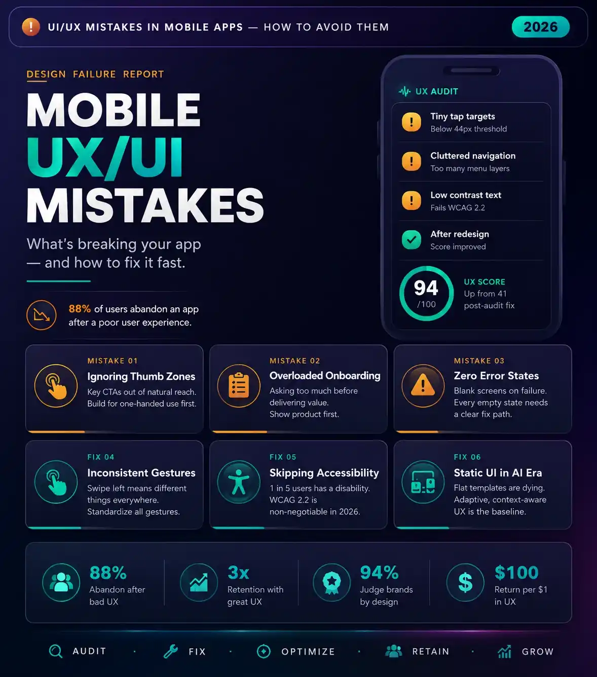
Avoiding critical UI/UX mistakes in mobile apps is the ultimate dividing line between viral product adoption and immediate deletion, especially for brands investing in professional UI/UX design services for mobile applications. In a digital market where user attention spans are measured in single-digit seconds, an application cannot afford a single point of friction.
>
Mobile product design is not an exercise in aesthetic indulgence; it is a clinical execution of behavioral psychology and technical performance. Principles explored in this 2026 guide to choosing the best UI/UX design agency for mobile applications. If your application frustrates a user’s instincts or ignores physical hand ergonomics, ultimately, those users will abandon your product for a competitor without a moment’s hesitation..
Design for the Mind: Overcoming Cognitive Load Friction
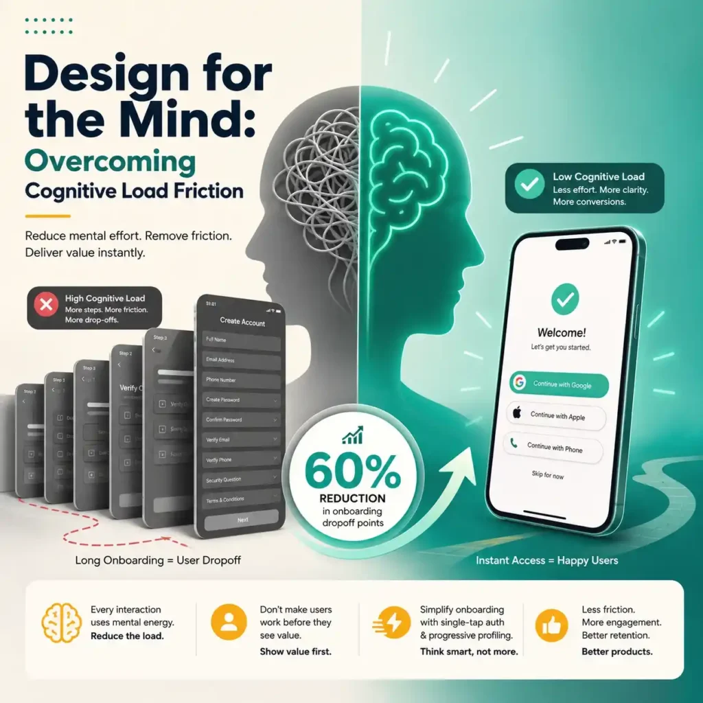
Applications that reduce early installation friction by implementing single-tap authentication and progressive profiling experience a 60% reduction in onboarding dropoff points compared to products utilizing legacy multi-screen registration walls. The lesson is simple: give users immediate access to the app’s value, then collect secondary profile data later.
Every digital interaction demands mental energy from the user. When an application forces a person to process excessive amounts of visual data, understand confusing icons, or navigate chaotic layouts, it causes immediate cognitive load friction. Human working memory is strictly limited. Your product must act as an intuitive guide, reducing the mental heavy lifting required to complete a task.
One of the most destructive manifestations of this friction occurs at the very beginning of the user journey: onboarding dropoff points. If the application makes its users go through a lengthy process of registering and verifying themselves before realizing its value, then many of them will abandon it.
User Flow Failures and Ergonomic Mistakes
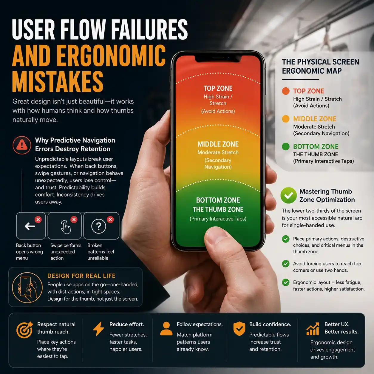
A primary symptom of catastrophic UI/UX mistakes in mobile apps is a total disregard for the physical reality of how humans hold and interact with mobile hardware. Designers often build layouts on massive desktop monitors; however, they forget that the final product must be controlled by a human thumb on a crowded subway train or while walking down a busy street..
Why Do Predictive Navigation Errors Destroy Mobile App Retention?
When an application layout suffers from predictive navigation errors, it actively breaks the established mental models that users have developed from using dominant operating systems and global platforms. If tapping a back button unexpectedly opens a root menu, or if a swipe gesture performs an erratic action rather than moving a carousel, then the user loses their sense of control. Predictability breeds comfort; violating basic interactive patterns guarantees that your product feels broken and unreliable.
The Physical Screen Ergonomic Map
| Zone | Description |
| TOP ZONE | High Strain / Stretch (Avoid Actions) |
| MIDDLE ZONE | Moderate Stretch (Secondary Navigation) |
| BOTTOM ZONE | THE THUMB ZONE (Primary Interactive Taps) |
Mastering Thumb Zone Optimization
To build a highly compliant mobile application, your structural blueprint must prioritize rigorous thumb zone optimization, a core focus area for the mobile app UI/UX design agency. The lower two-thirds of the smartphone screen represents the most accessible natural arc for single-handed navigation.
Placing primary action buttons, destructive choices, or critical menu selectors at the extreme top corners of the screen forces uncomfortable hand adjustments or demands two-handed operation. Restricting your primary interactive elements to the lower third of the display directly prevents user physical fatigue and accelerates task completion speeds.
The Invisible Killers: Performance and Multi-Device Flaws
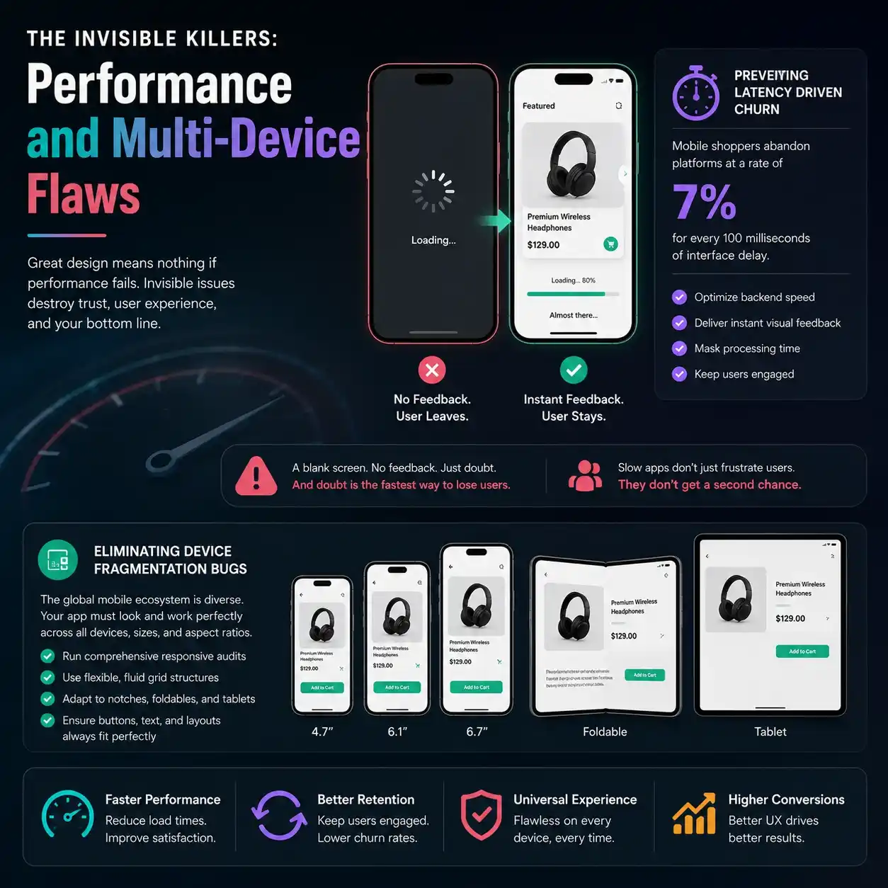
User experience is not a purely visual discipline. It is deeply bound to the technical execution and structural elasticity of the underlying codebase. You can design the most gorgeous layout in the world, but if the technical foundation stumbles, the user experience collapses completely.
Preventing Latency Driven Churn Through Tactical Feedback
A massive percentage of uninstalls stems directly from latency driven churn. If an application displays a blank screen while loading information, the user may think that the app is not working anymore. The absence of any kind of visual feedback leads to app abandonment.
Performance metrics indicate that mobile shoppers abandon platforms at a rate of 7% for every 100 milliseconds of interface delay. Mitigating this issue requires combining backend speed optimization with clever visual feedback that masks necessary processing times.
Eliminating Device Fragmentation Bugs
The global mobile ecosystem is incredibly diverse. Your product must perform flawlessly across varying screen sizes, pixel densities, aspect ratios, and modern foldable form factors. Failing to run comprehensive responsive audits leads to devastating device fragmentation bugs, where critical interactive buttons get clipped beneath hardware camera notches, or text blocks overlap on smaller screens. UI layers must be built using flexible, fluid grid structures that adapt dynamically to any screen resolution.
Ethics and Inclusivity: Accessibility Compliance Gaps
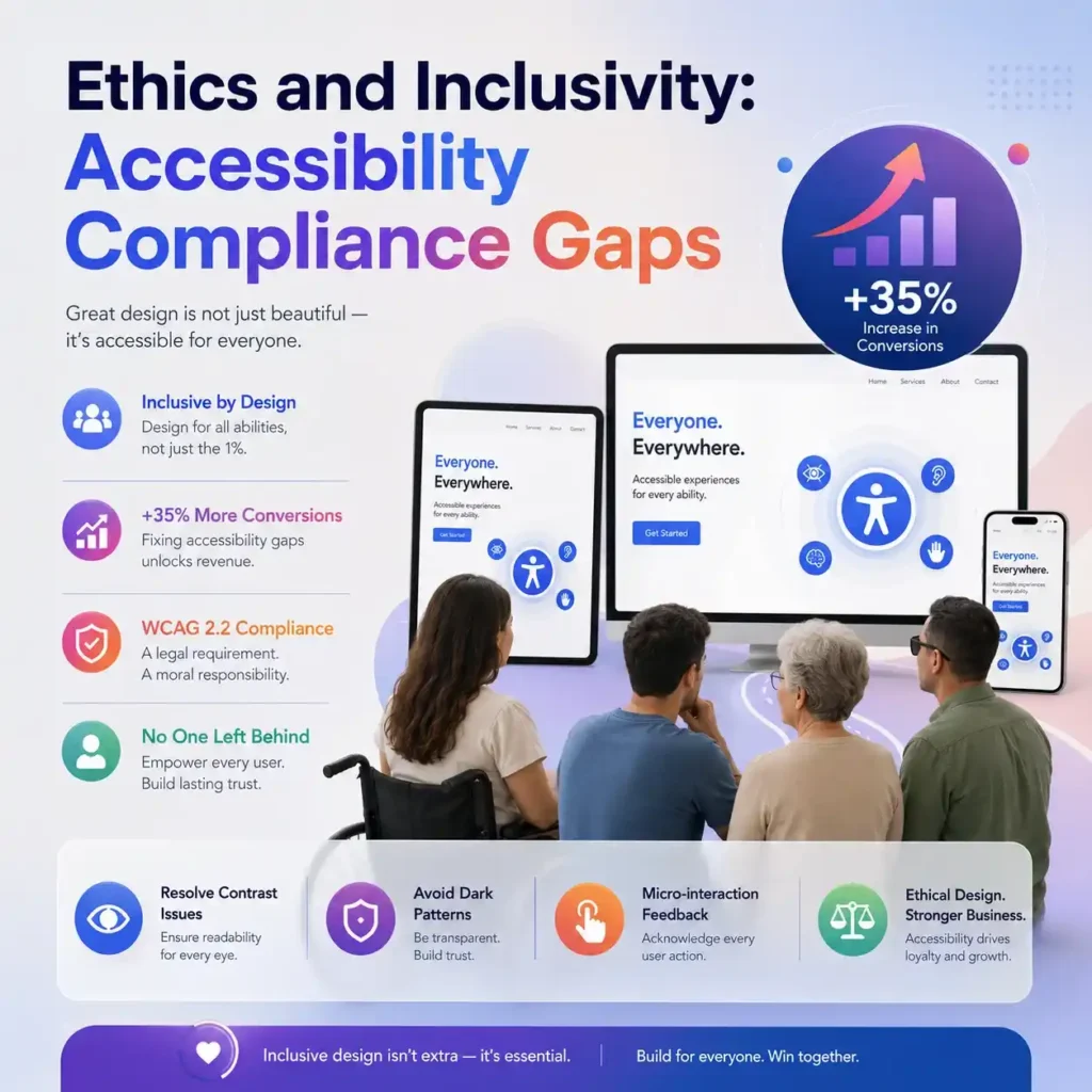
Modern design demands absolute inclusivity. It is a short-sighted approach to design applications exclusively for the young generation with sharp eyesight using high-end devices..
Why Fixing Accessibility Compliance Gaps Restores Revenue?
Currently available data reveals that enterprise platforms that methodically resolve their core design accessibility issues achieve a 35% increase in total digital conversion rates by capturing demographics that were previously unable to navigate their workflows.
Neglecting universal access guidelines creates severe accessibility compliance gaps that actively lock out millions of potential customers with visual, motor, or cognitive impairments. Adhering to updated WCAG 2.2 guidelines is a strict commercial and legal necessity.
Resolving Semantic Contrast Issues
One of the most frequent visual mistakes in modern mobile software is the presence of severe semantic contrast issues. Designers often pick trendy light-gray text on white backgrounds or small font weights to achieve a minimalist look.
In the real world, this choice makes the app completely unreadable under direct sunlight or for individuals with low visual acuity. Using distinct color ratios and dynamic typography sizing scales guarantees that your application remains readable under any environmental condition.
Banishing Dark Pattern Pitfalls
Your interface must build long-term brand equity, which means you must completely eliminate dark pattern pitfalls. Tricks of deceptive design can help improve numbers in the short run; however, they will inevitably harm customers’ trust in the long term. Transparency is the only sustainable retention strategy.
Eliminating Micro-interaction Feedback Failures
Every human action inside a digital environment requires an acknowledgment. When an application suffers from micro-interaction feedback failures, users tap buttons multiple times because the screen gives no sign that the command was received.
Every button press must trigger a subtle haptic pulse, a clear color shift, or a smooth micro-animation. This direct sensory confirmation assures the user that the system is processing their input, preventing accidental duplicate actions and ordering errors.
If you want a deeper breakdown of modern mobile usability systems, explore our Best UI/UX Design Agency for Mobile App Development (Your 2026 Guide)
FlowmazeUX: Stop Annoying Your Users. Start Making Money.
Resolving complex UI/UX mistakes in mobile apps requires an agency that prioritizes human behavior metrics over subjective design trends. At FlowmazeUX, we dismantle digital friction and rebuild interfaces into high-converting, intuitive product ecosystems. Not just that! We map out the exact psychological and physical journeys of your target users to confirm your application scales effortlessly.
Our experts deliver superficial visual makeovers. This team performs comprehensive audits to reduce onboarding drop-offs and fix ergonomic design issues. They also ensure your product meets international accessibility standards.
Frequently Ask Questions
The most damaging error is forcing excessive user friction during the initial entry point. High onboarding dropoff points caused by demanding long registration forms before users can see the core product value will kill your retention metrics faster than any other flaw.
When an interface is cluttered or confusing, it overwhelms the user's mental capacity. Rather than trying to figure out how to navigate an unorganized screen, users experience frustration, abandon their current task, and close the app entirely.
The core rule is to place all primary interactive elements, call-to-action triggers, and common navigation bars within the natural, easy reach of a user's thumb when they hold a device with a single hand. This typically covers the lower two-thirds of the screen.
Conduct unguided user testing sessions. If you notice users consistently hitting a back button expecting one result, but the interface takes them somewhere else completely, your application is violating standard mental models and suffering from navigation errors.
Even on high-speed networks, minor server delays occur. If your app interface lacks responsive states like skeleton screens or loading bars during these brief pauses, users assume the system has crashed and shut down the app.
These issues occur when the color value of your text is too close to the color value of the background, making reading difficult. You fix this by testing your layouts against WCAG guidelines to verify that contrast ratios meet or exceed strict readability standards.
While deceptive interfaces might temporarily boost short-term registrations or upsells, they anger users. This leads to high uninstallation rates, negative app store reviews, and permanent brand damage that costs far more than the temporary profit generated.
When a button gives no visual, haptic, or auditory signal upon being tapped, it leaves the user in total isolation. They cannot tell if the app is loading, if their tap missed the target, or if the system is completely unresponsive.