Component Library Creation
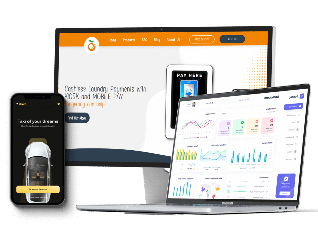
Flowmaze builds scalable design systems and reusable UI libraries tailored to your product so your team can move faster with consistency, clarity, and fewer design-to-dev misfires. Whether you're scaling a SaaS product or launching multiple apps, a solid component library becomes your UX foundation.
What’s Included in Our Component Library Services
We help you create, document, and maintain a component-based system that aligns design, development, and product across every release.
Design Component Creation (Figma)
We create a reusable design system in Figma complete with buttons, forms, modals, tables, and responsive components following your brand.
Naming & Structure Standards
We bring structure and logic to your library with organized folders, naming conventions, and variants that make handoff and reuse seamless.
Documentation & Usage Guidelines
We provide best practices, usage examples, and handoff documentation to ensure consistent application across teams and designers.
Design-to-Code Mapping
We help align your Figma components with your frontend stack (React, Storybook, Webflow, etc.) — bridging the gap from pixel to production.
Accessibility-Ready Components
All design patterns are built with accessibility in mind supporting WCAG 2.1 compliance from the start.
Why Flowmaze for Component Library Creation?
Our design systems go beyond style; they’re engineered for speed, scalability, and clarity across product, design, and dev.

Designed for Scaling Products
We help you avoid design drift, reduce inconsistencies, and speed up future sprints with a scalable component.

Figma Best Practices Built In
Auto layout, variants, interactive components, and reusable styles built the right way from the start.

Frontend-Ready Thinking
We adapt to your tech stack React, Next.js, Webflow, Vue, or static builds and align with your deployment model.
Fewer Redesigns, Faster Launches
Your team reuses proven components making new features quicker to design, review, and build.

Cross-Team Collab Easier
Designers, devs, and PMs work from the same source of truth increasing clarity and velocity.

Ongoing Maintenance & Support
We maintain and evolve your system over time refining components.
Our Component Library Creation Process
01
Audit & Discovery
We review your current designs (or lack thereof), UI inconsistencies, and developer workflows to understand needs and gaps.
02
Component Planning
We map out essential components (e.g., buttons, inputs, cards, modals, navigation) and align naming + logic across design and dev.
03
Figma Library Build
We create responsive, well-structured components in Figma with variants, auto layout, and interaction states.
04
Documentation & Usage Guide
We build a usage guide (in Notion or inside Figma) to explain how, when, and why to use each component reducing guesswork.
05
Design-to-Code Bridge
We align with your dev team to ensure frontend implementation mirrors the design library offering code mapping and support.
06
Handoff & Maintenance Options
We deliver your completed design system or optionally continue maintaining it as a live design partner.
Ideal For Teams Who Are:
Scaling Fast
- Launching multiple products
- Adding new features monthly
- Working across squads or pods
Scaling Fast
- Launching multiple products
- Adding new features monthly
- Working across squads or pods
Experiencing Design Inconsistencies
- Duplicate or conflicting styles
- Devs building from scratch every time
- Poor design-to-code alignment
Experiencing Design Inconsistencies
- Duplicate or conflicting styles
- Devs building from scratch every time
- Poor design-to-code alignment
Building Design Systems from Scratch
- No current design system
- Want to do it right before product grows
- Need a developer-aligned Figma foundation
Building Design Systems from Scratch
- No current design system
- Want to do it right before product grows
- Need a developer-aligned Figma foundation
Using React, Webflow, or Modular UI
- Need components to map to code cleanly
- Planning to scale design + frontend with shared components
- Want accessible UI from day one
Using React, Webflow, or Modular UI
- Need components to map to code cleanly
- Planning to scale design + frontend with shared components
- Want accessible UI from day one
Frequently Asked Questions
Yes, we use Figma as the base and follow best practices like auto layout, variants, and naming consistency.
Absolutely. We work with your dev team (React, Storybook, etc.) to ensure smooth design-to-code handoff.
Yes, we frequently help teams with no existing design system start from the ground up.
Yes. We provide documentation inside Figma and optionally in tools like Notion, Zeroheight, or Storybook.
Yes, we offer support retainers to evolve and scale your design system over time.