Dashboard UX Design
Flowmaze designs powerful dashboards that simplify complex data, improve user decision-making, and enhance productivity. Whether you're building a SaaS platform, internal admin panel, analytics tool, or executive dashboard, we craft user interfaces that transform information into action.
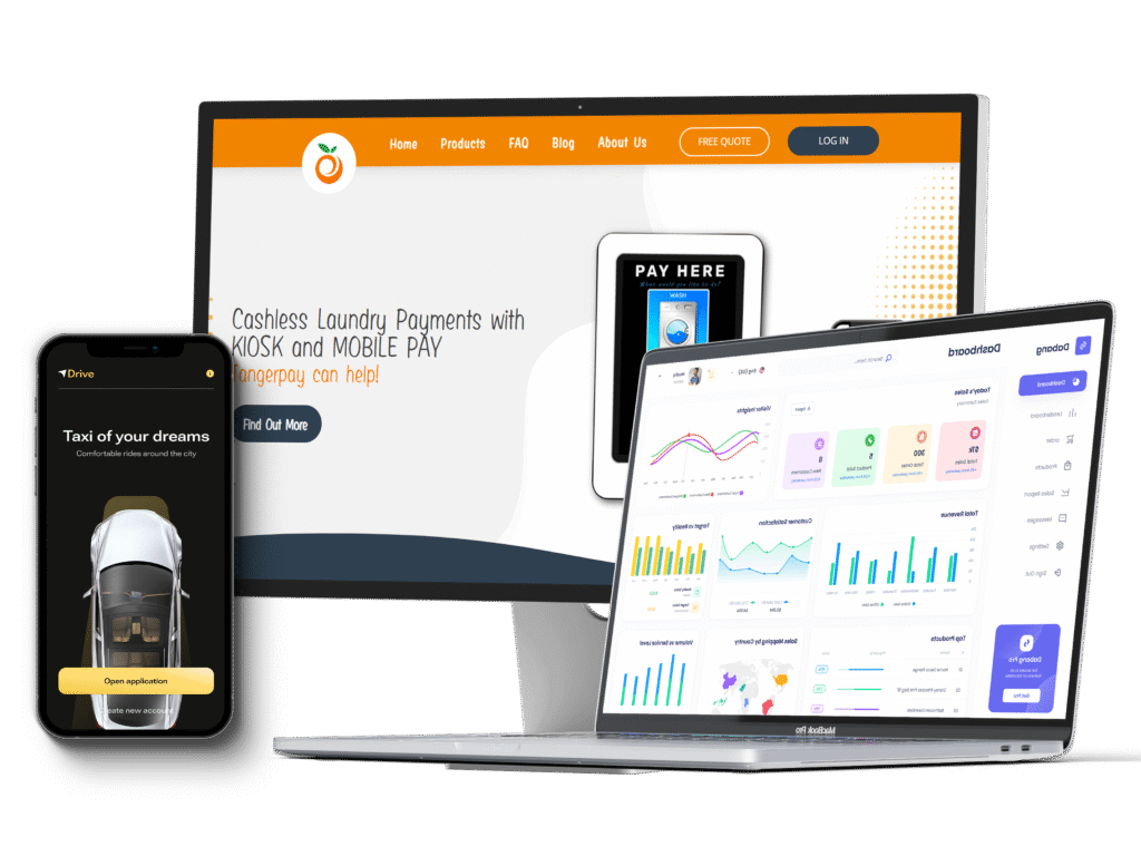
Our Strategic & Reliable Dashboard Design Services
From mapping out flows to crafting developer-ready UI systems, we design dashboards that make data readable, workflows actionable, and teams faster.
SaaS Dashboards
Multi-tenant SaaS dashboards with modular layouts, notifications, analytics, and real-time data integration built to scale as your business grows.
These dashboards are designed to handle large user bases and complex datasets without slowing down. With role-based access, live API integrations, and customizable widgets, teams can view relevant metrics instantly and take action without navigating multiple tools.
Admin Panels
Easy-to-use admin tools with user and permission management, content control, and task workflows that help teams stay organized and reduce support overhead.
Behind the scenes, these panels are built on scalable architectures that allow smooth onboarding of new users, granular access control, and activity tracking. Automation features, audit logs, and responsive layouts make managing internal operations faster and less error-prone.
Analytics Dashboards
Custom dashboards with filters, KPIs, drill-downs, and interactive visualizations that make data meaningful without overwhelming the team.
The dashboards support real-time data streams and advanced charting libraries, giving teams the ability to track performance trends, detect anomalies, and generate reports on the fly. Integration with multiple data sources ensures a single, reliable source of truth.
Inventory Dashboards
Track transactions, payouts, stock levels, and revenue forecasts with dashboards that keep backend operations organized and transparent.
These dashboards include automated alerts for low stock, batch updates for large inventories, and predictive analytics for demand planning. The system is built to sync across warehouses, vendors, and sales channels to prevent errors and improve decision-making.
Logistics Dashboards
Operational control panels with order management, delivery tracking, fleet monitoring, and warehouse data designed for efficiency.
Advanced tracking modules provide real-time updates on shipments and deliveries, while route optimization algorithms improve fleet performance. Integration with ERP systems, dynamic reporting, and mobile-friendly layouts ensures managers have the insights they need at any moment.
Why Choose Flowmaze for Dashboard UX Design?
We design dashboards that do more than look good; they help users understand, act, and move faster with clarity and confidence.

Data-Driven Design Thinking
We focus on structure, hierarchy, and usability to make complex data feel easy to consume and interact with.

UX Simplification of Complexity

Custom Visualization Components
We design dynamic components, charts, graphs, counters, maps to your data model and user needs.

Scalable UI Systems
Design systems that maintain consistency as your dashboard evolves, supporting both dev velocity and UX consistency.

WCAG & Accessibility First
Color contrast, keyboard navigation, and screen reader readiness come baked into every dashboard we build.

Close Developer Collaboration
We work side-by-side with your engineers to deliver dev-ready design assets, specs, and frontend UI guidance.
A Snapshot of Our Dashboard Design Process
We follow a modular design process built for dynamic products and data-rich environments.
01
Discovery & Audit
We explore your business goals, user roles, and data complexity to set the foundation for smart UX decisions.We align your app’s vision with user needs through interviews, competitor research, and persona development.
02
User Flows
We define user types, typical tasks, and data interactions to map out intuitive workflows and navigation logic.
03
Wireframes
Low-fidelity wireframes clarify layout, relationships between modules, and flow before visual styling.
04
UI Design
We design high-fidelity interfaces with data components like charts, graphs, counters, lists, filters, and cards.
05
Prototyping
06
Handoff & Documentation
Figma specs, design tokens, component libraries, and developer checklists all delivered with clarity and collaboration.
Industries-Focused Dashboard Solutions
We’ve designed dashboards across industries each with different data, workflows, and business goals.
SaaS Platforms
- User analytics dashboards
- Engagement tracking & retention metrics
- Admin management & subscription controls
SaaS Platforms
- User analytics dashboards
- Engagement tracking & retention metrics
- Admin management & subscription controls
Finance & Fintech
- Transaction dashboards
- Revenue tracking & forecasting
- Payout, KYC, and balance overviews
Finance & Fintech
- Transaction dashboards
- Revenue tracking & forecasting
- Payout, KYC, and balance overviews
Logistics & Supply Chain
- Delivery status & order tracking
- Warehouse & inventory monitoring
- Live fleet or driver data visualizations
Logistics & Supply Chain
- Delivery status & order tracking
- Warehouse & inventory monitoring
- Live fleet or driver data visualizations
Healthcare & MedTech
- Patient record dashboards
- Provider scheduling panels
- Diagnostic analytics & medical logs
Healthcare & MedTech
- Patient record dashboards
- Provider scheduling panels
- Diagnostic analytics & medical logs
E-commerce Operations
- Sales tracking dashboards
- Fulfillment & inventory panels
- Performance metrics for product/category
E-commerce Operations
- Sales tracking dashboards
- Fulfillment & inventory panels
- Performance metrics for product/category
EdTech & Learning
- Student performance dashboards
- Course engagement analytics
- Educator tools for class monitoring
EdTech & Learning
- Student performance dashboards
- Course engagement analytics
- Educator tools for class monitoring
Frequently Asked Questions
Dashboards involve dense data, multiple user roles, and frequent interaction with charts and tables, we design for clarity, prioritization, and quick action.
Yes. We prepare responsive, component-based layouts and deliver developer-friendly assets with annotations, specs, and interaction guidance.
Absolutely. We audit current dashboards to identify usability issues, friction points, and inconsistencies, then redesign with UX precision.
We design tables, line/bar/pie charts, progress meters, heatmaps, counters, timelines, and filters customized to your needs.
Basic dashboards may take 3–4 weeks, while larger SaaS platforms can span 6–10 weeks depending on complexity, states, and integration needs.
