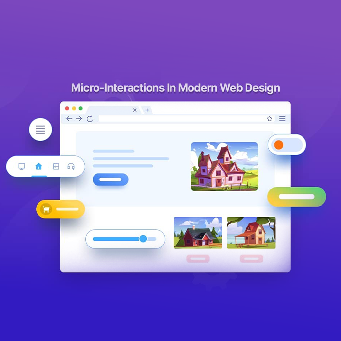
In fact, these small touches are called micro-interactions. They are the subtle feedback loops that give a pure digital experience. You may not always notice them, but you always feel them. They guide you, reward you, and quietly build trust.
Let’s uncover how invisible design shapes the way users connect with products and why these details create such powerful outcomes.

Micro-interactions are the smallest parts of a digital experience that communicate feedback to the user. When a button changes color, a progress bar fills, or a gentle vibration confirms an action, the system is saying “yes, we heard you.”
They exist to make interactions human. They provide reassurance, confirmation, and comfort. A user tapping “submit” does not want silence. A tiny animation signals progress and builds confidence.
A global UX study found that over 70 percent of users say micro-interactions make apps feel smoother and more human. This is because people respond emotionally to motion, timing, and rhythm. Even the smallest design choices change how someone feels about a brand.

The way something moves on a screen can change the way it feels in the mind. Micro-interactions influence how users perceive trust, care, and quality.
A soft transition creates calm. A playful bounce adds delight. A fast, snappy movement communicates confidence. These moments trigger emotional responses long before a person forms a conscious opinion.
When people feel at ease, they explore more. When they feel connected, they return. Airbnb’s booking flow, for instance, uses subtle transitions that make each step feel guided and safe. It is not just functionality. It is emotional reassurance built into the design. Invisible design is emotional design. Every pixel in motion carries meaning.

A strong user experience goes beyond how fast something works. It focuses on how smooth it feels from start to finish. Micro-interactions make that possible.
Micro-interactions quietly direct attention. A form field glowing after input. A loading indicator showing progress. These signals guide users without overwhelming them. They remove hesitation and create rhythm in navigation.
Every action deserves a response. When users see instant feedback, they feel in control. A small animation or vibration acknowledges their input. It tells them the system is alive. These cues reduce friction and frustration, especially during tasks that require focus. Hence, when feedback is natural, flow remains unbroken. The user stays in sync with the interface, moving forward effortlessly.
When users experience smooth interactions, they stay longer and engage more. A minor change, such as a one-second delay or a missing confirmation, can increase frustration sharply. In one usability study, a 0.3-second lag reduced task completion rates by 40 percent.
Good micro-interactions build memory. Users are more likely to remember how an app felt than how it looked. This feeling translates into loyalty. A design that feels trustworthy keeps people coming back. Every brand wants attention, but the best ones earn it through ease and comfort.

Rule 1: Start with Emotion, Not Animation.
A good interaction should connect first and impress later. Focus on what you want the user to feel.
Rule 2: Keep It Purposeful.
Every small motion should help users know or feel something. If it doesn’t guide, inform, or reassure, it adds noise.
Rule 3: Design for Timing.
The magic is in milliseconds. Quick enough to feel responsive. Smooth enough to feel natural.
Rule 4: Stay Subtle.
Design should whisper, not shout. When movement feels effortless, users trust it.
Rule 5: Test the Feeling.
Ask users how it feels, not just what they think. Emotion is the true metric of good design.

At Flowmaze UX, we design for what users feel before they even think about it. Every micro-interaction we craft is deliberate and purposeful, created to guide, reassure, and delight users at every step. Moreover, our process unifies psychology with design logic, turning small moments into experiences people remember.
We help brands translate empathy into interaction. Because trust does not come from visuals alone. It comes from how a design responds, moves, and reassures.
If you want to rethink how your product feels to users, talk to us about your next invisible design win. The consultation is free, and the insight is lasting.
The most powerful designs are the ones that disappear into experience. People remember the feeling of clarity, the sense of ease, and the quiet confidence that comes from a product that simply works. Invisible design is not about doing more. It is about caring more about the details that users never see but always feel.
The headline and above-the-fold section are the most critical. Within seconds, visitors decide whether to stay or leave. A clear headline, compelling value proposition, and visible CTA make the biggest impact.
They make users feel acknowledged and confident. Each small signal builds trust between the person and the product.
When users feel in control, they stay longer. Smooth feedback reduces frustration and encourages repeat visits.
Designers often use tools like Figma or Principle. At Flowmaze UX, we focus more on timing, emotion, and usability than on software choice.
It should feel natural, be visually subtle, and respond instantly to user input. The best ones go unnoticed yet make the experience flow perfectly.
They increase conversions by improving comfort and clarity. A design that feels intuitive leads to smoother user journeys and better performance.
Yes. Even one thoughtful animation or visual cue can improve user trust. Subtle design signals professionalism and care.
We test for emotion, not just functionality. Every Flowmaze UX project includes real-user feedback to ensure that the design feels natural and meaningful.
