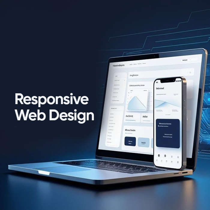
California local businesses compete in one of the most digital-first markets in the world. Customers search on phones while walking through Los Angeles, compare services on tablets in San Diego, and make quick decisions on laptops in San Jose offices. In this environment, responsive web design plays a direct role in how a business appears, feels, and performs online.
A website that adapts smoothly across devices supports California local SEO, strengthens credibility, and helps nearby customers take action faster.
Why Mobile Behavior Makes Responsive Web Design Essential for California Local Search

Search behavior across California cities shows a strong mobile pattern. People look for services during commutes, between meetings, and while exploring neighborhoods. Google local search results California businesses appear in are heavily influenced by mobile usability, page speed, and layout stability.
Local businesses in San Francisco and Sacramento often serve audiences who expect fast-loading websites with clear navigation. A layout that works only on desktop limits visibility in location-based search optimization and reduces engagement from mobile-first users.
Mobile-friendly websites in California also support map listings, click-to-call actions, and location intent searches. These factors directly affect how local brand visibility grows in competitive metro areas.
Responsive Web Design and Local SEO Performance

How Responsive Web Design Supports California Local SEO Rankings
Responsive web design allows one website to serve all screen sizes while maintaining consistent content, URLs, and technical structure. This approach aligns well with Google’s mobile-first indexing and improves local business web design in California.
When a site adapts properly:
Pages load faster across devices
Content remains readable without zooming
Navigation stays usable on smaller screens
These signals support stronger placement in Google local search results California users rely on every day. Local SEO performance improves because search engines can crawl and index the site efficiently while users stay engaged longer.
For Los Angeles local businesses competing in crowded markets, these details influence both rankings and trust.
Industry standards for responsive layouts and mobile-first indexing can also be explored through research from responsive web design principles and Google’s documentation on mobile-first indexing
Mobile-Friendly Design and Trust Signals for California Customers

California customers assess credibility quickly. A website that looks broken on mobile or inconsistent across devices affects perception instantly. Responsive layouts create a sense of professionalism and stability, which matters for San Diego service providers and San Jose startups alike.
User-centric web design helps visitors:
Read service details without friction
Navigate locations and contact pages easily
Complete forms without layout issues
These elements support customer trust for local businesses and reduce hesitation during decision-making.
City-Level Impact of Responsive and Mobile-Friendly Web Design Across California
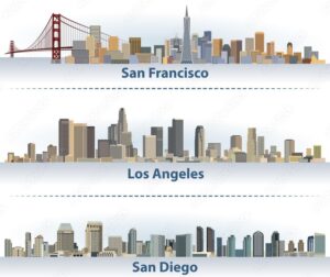
Los Angeles
Los Angeles local businesses serve diverse audiences across many neighborhoods. Cross-device compatibility ensures visitors browsing on phones, tablets, or desktops receive the same quality experience. This consistency supports nearby customer engagement and repeat visits.
San Francisco
San Francisco small businesses often attract tech-savvy users who expect fast-loading websites and clean interfaces. Mobile user experience plays a major role in keeping bounce rates low and supporting local brand credibility.
San Diego
San Diego service providers benefit from responsive layouts that highlight contact actions clearly. Mobile-friendly websites in California help customers schedule services or make inquiries while on the move.
San Jose and Sacramento
San Jose startups and Sacramento local brands rely on conversion-focused design to turn search traffic into leads. Responsive interfaces ensure forms, CTAs, and service sections function smoothly across devices.
Conversions Depend on Mobile-Friendly and Responsive Web Design

Local traffic converts when the experience feels effortless. Responsive layouts remove barriers that slow down decision-making. Buttons stay accessible, text remains readable, and images scale correctly.
Conversion-focused design supports:
Click-to-call actions for local searches
Fast access to directions and service areas
Smooth form completion on mobile devices
These factors influence how effectively a website turns local searches into real business outcomes.
Website Performance, Speed, and Technical Accuracy in Responsive Web Design
Fast-loading websites perform better in both search visibility and user engagement. Responsive builds reduce unnecessary redirects and duplicate content issues. This technical efficiency supports location-based search optimization across California.
Key performance considerations include:
Optimized images for multiple screen sizes
Clean CSS and layout structure
Stable visual elements during loading
Together, these details improve mobile user experience while supporting long-term local SEO growth.
How FlowmazeUX Improves Local UX with Responsive Web Design
FlowmazeUX designs interfaces with real user behavior in mind. Local business website optimization requires more than visual consistency. It involves understanding how people search, browse, and act within specific cities.
Businesses looking to improve digital experiences often benefit from web app design, mobile app design and dashboard design solutions.
By focusing on cross-device usability, performance, and clarity, We supports California businesses aiming to strengthen visibility and conversions through design that aligns with local search behavior.
Final Take!
California local markets reward websites that feel reliable, fast, and easy to use. Responsive layouts support local SEO signals, customer trust, and conversion paths across cities with high competition and mobile-first audiences.
A well-structured, responsive website becomes a long-term asset for businesses seeking stronger placement in local searches and consistent engagement across every device.