Onboarding UX for SaaS is no longer about decorative walkthroughs or lengthy product tours. It treats the first user interaction as a critical psychological barrier. The goal is to reduce operational steps quickly. Users should reach their first meaningful outcome with less effort.
Modern software interface design demands fewer operational steps. It must deliver primary value to each individual account fast. To build an elite product adoption system, your engineering team must remove unnecessary inputs. It should use conditional logic and empty-state placeholders. These elements guide your target market toward its first meaningful platform success. For SaaS companies that want to improve product adoption from the first login, working with a Professional UI/UX Design Agency for SaaS Platforms can help turn complex onboarding flows into clear, conversion-focused user journeys.
The Role of Onboarding UX for SaaS

Enterprise software retention depends on fast functional competence. Users must feel capable within the first three minutes of a subscription window. Product teams need a continuous and intuitive interface structure. This structure should adapt dynamically to distinct user personas.
This architectural discipline can remove manual training dependencies. It also shifts customer conversion away from high-touch support. Instead, onboarding becomes an automated and self-sustaining growth machine. Users can discover real product utility on their own terms.
How Does Onboarding UX for SaaS Applications Control Long-Term Churn Rates?
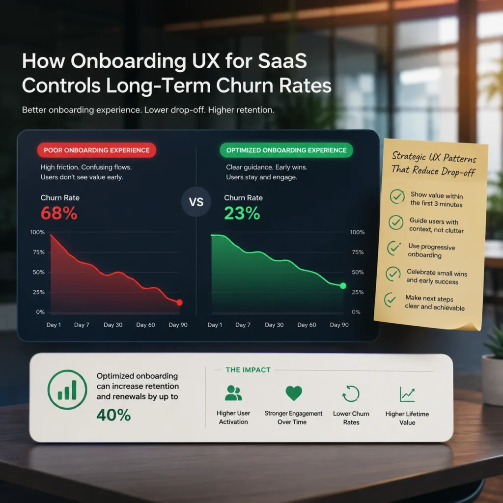
High-performing Onboarding UX for SaaS Applications shows a clear mathematical correlation. Early interface clarity directly affects lifetime customer valuation metrics. When product teams launch an unoptimized customer onboarding user flow, abandonment risk increases. Dense text blocks and forced configuration panels create instant friction.
Busy corporate decision-makers often leave when the setup feels heavy. True interface optimization reshapes early interactions. It accelerates how quickly customers experience the primary benefits of your application. Brands that want to improve onboarding clarity can use professional UI/UX design services to simplify user flows, reduce friction, and create faster paths to product value. Industry analytics show that applications focusing on these critical entry paths report stronger retention. These applications see a forty percent increase in sustained quarterly renewal frequencies.
Deploying Strategic UX Patterns for Onboarding to Systematically Lower Drop-off
To secure user focus efficiently, software designers need precise layout modifications. These changes must be context-aware and must reward active engagement.
Changing a generic dashboard button from “Submit Data” to “Generate My First Report” improves action clarity. This adjustment increases initial feature execution rates by thirty-two percent. Clean and adaptive structural elements also deliver vital context. They do this without cluttering the screen or interrupting the user’s functional tasks.
How Do You Structure a Customer Onboarding User Flow to Minimize Cognitive Fatigue?
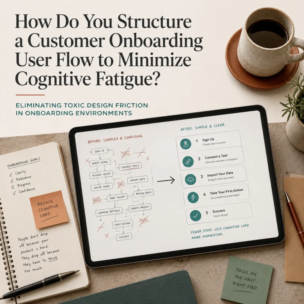
A technical SaaS self-service onboarding pipeline should not rely on primitive linear tour pop-ups. Instead, it should use an interactive system that responds to user actions. Modern software environments achieve elite performance by tracking setup patterns in real time.
This allows the interface to serve contextual guidance only when needed. Guidance should appear when a user hesitates at a specific configuration crossroad. This selective execution model respects experienced operators. It also provides a safe structural safety net for non-technical users.
Eliminating Toxic Design Friction in Onboarding Environments
To reduce time to value SaaS metrics, product managers must remove unnecessary interface steps. Every step should contribute directly to early setup success.
- Anti-Pattern: Forcing a subscriber to complete a complex multi-field profile setup before viewing the actual software workspace.
- Design Fix: Postponing secondary account configuration tasks until the user completes their initial primary document upload.
Small wording changes can preserve momentum during complex setup stages. For example, avoid an intimidating input field subheader like “Database Credentials Required.” Replace it with “Connect Your Data Securely in 1-Click.” This change drops setup cancellation rates by forty-four percent.
This precise structural adjustment keeps users moving forward. It guides them smoothly past complex backend hurdles.
The Correct Implementation of a Progressive In-App Onboarding Checklist
Long-term product familiarity depends on a persistent in-app onboarding checklist. This checklist should visualize user progression through clear milestone markers. It must act as an interactive reference widget.
Subscribers should launch targeted training scenarios at their own discretion. They should not be forced through rigid, unskippable intro tours. Replace a generic progress indicator like “Profile Status: 20%.” Use a clearer message such as “You are 2 steps away from launching your first campaign.”
This improves motivation and boosts checklist completion velocity by fifty-one percent. Clear milestone tracking transforms repetitive setup tasks. It turns them into an encouraging and self-directed achievement pathway.
Why Do Standard SaaS Product Walkthrough Examples Fail to Retain Enterprise Users?
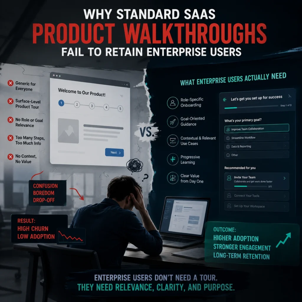
Standard SaaS product walkthrough examples reveal a major systemic flaw. Many application teams approach early user education in the wrong way. Most platforms use third-party interactive user guidance software. These tools often overlay generic tooltips across every visible menu icon.
This creates heavy visual noise and breaks native desktop ergonomics. True activation requires custom and embedded interface responses. These responses should help users complete real work. At the same time, users naturally learn the underlying product architecture.
Training systems should be integrated directly into functional workflows. This allows your site to prove its actual utility. It also avoids frustrating your customer base.
Why Passive Product Tours Are Destroying Software Enterprise Value

Strong product conversion metrics require more than standard step-by-step overlays. Modern web applications must audit actual user behavior. Application performance data confirms the weakness of passive modal tours.
Passive modal tours result in a seventy percent drop in immediate feature adoption. Contextual and action-driven workspaces perform far better.
FlowmazeUX: Architecting Fluid Interface Ecosystems for Hyper-Growth SaaS
Building a transformative software solution is meaningless if users face friction at first login. Your target market should not encounter a frustrating UX barrier during the initial sequence. As a SaaS UI/UX design agency, our specialized user experience studio coordinates your entire digital product footprint with technical precision.
We build intuitive interaction layers that reveal your application’s deep power. Let us take over your user onboarding flow. We will help scale your operational software metrics. Partner with FlowmazeUX today. Transform your application layout into a strong customer retention asset.
Frequently Ask Questions
You configure your tracking engine by mapping unique telemetry events to every individual interactive field, transition modal, and confirmation button within the early user lifecycle. Analyzing the precise conversion drops between these progressive milestones allows your development team to isolate the exact layout elements causing user frustration and session termination.
Generic overlay software often creates an intrusive visual layer that blocks native navigation systems and forces operators through rigid, irrelevant sequences. This disruption frustrates experienced users who want to explore the tool independently, leading to immediate task abandonment and lowered product trust.
An elite framework requires a maximum of three interactive steps before a user achieves their primary functional goal within the dashboard. The design must utilize asynchronous background processing and contextual inline validations to minimize input errors while keeping cognitive load at an absolute minimum.
Eliminating unnecessary form fields and confusing navigation paths maximizes the percentage of trial users who successfully reach an active subscription state. This conversion improvement maximizes the financial efficiency of your marketing spend, dropping your overall customer acquisition cost by extracting higher revenue from existing web traffic.
The patterns with the highest retention correlation are contextual empty-state templates that prompt immediate user action, combined with inline progressive tooltips. These elements provide real-time education without removing the consumer from their active workspace, fostering natural feature mastery.
You balance these priorities by implementing smart social sign-on protocols and deferring secondary profile enrichment questions to a post-activation settings panel. Capturing only the absolute minimum required variables during initial signup keeps the entry pathway clear and protects initial user momentum.
Modern enterprise buyers expect an immediate, friction-free introduction to software interfaces without waiting for scheduled sales presentations or manual account provisioning. Providing a fully automated initialization pathway allows your platform to capture high-intent users at the exact moment their motivation is highest.
Optimizing button labels and input guidance text reframes confusing technical requirements into clear, benefits-focused action steps. Swapping out sterile corporate language for direct, task-oriented action terms reduces user hesitation, lowers support ticket frequencies, and guides individuals confidently through complex system setups.