Table of Content
Don’t Miss Crazy Facts of the Market!
Why SaaS Platforms Need Specialized UI/UX Design
Key Features of a High-Converting SaaS UI/UX Design
How to Choose a UI/UX Design Agency for SaaS Products
UI/UX Design Process for SaaS Platforms
Common UI/UX Mistakes in SaaS Platforms
SaaS Dashboard Design Best Practices
Onboarding UX for SaaS Applications
Case Study: How UI/UX Improved SaaS Product Growth
Fix Your Trash UX or Keep Losing Cash
Introduction
Building a software product without a dedicated UI/UX design agency for SaaS platforms is a fast track to wasting your venture capital on user churn. Most software founders think they have a feature problem when they actually have a clarity problem. You do not need another bloated drop-down menu. You need a product that does not make your users want to smash their keyboards. When software feels like a chore, people cancel their subscriptions before the trial period ends.
- Pretty interfaces are completely useless if the underlying system confuses the person paying for it.
- Users abandon complex applications within minutes if they cannot find the core value immediately.
- A great agency focuses on user retention and product metrics over artistic awards.
Don’t Miss Crazy Facts of the Market!
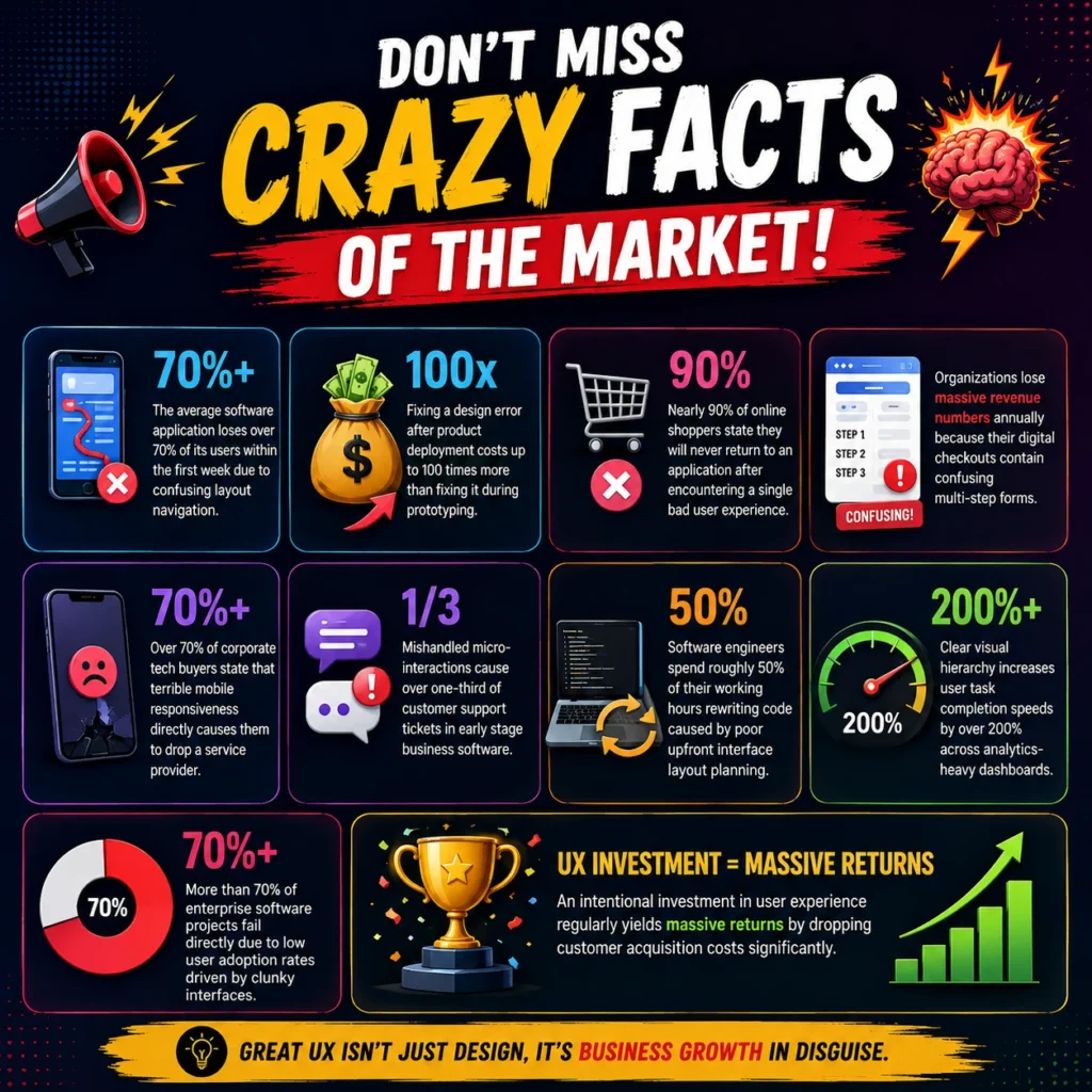
Bad software interface engineering costs the global economy billions every single year in wasted time and abandoned checkout funnels. Software developers spend half their time fixing preventable usability blunders rather than building new product features. If your application frustrates a corporate buyer, they will replace your system with a competitor before the fiscal quarter ends. Here is the data proving that bad product design is an absolute business killer.
- The average software application loses over seventy percent of its users within the first week due to confusing layout navigation.
- Fixing a design error after product deployment costs up to one hundred times more than fixing it during prototyping.
- Nearly 90% of online shoppers state they will never return to an application after encountering a single bad user experience.
- Organizations lose massive revenue numbers annually because their digital checkouts contain confusing multi-step forms.
- Over 70% of corporate tech buyers state that terrible mobile responsiveness directly causes them to drop a service provider.
- Mishandled micro-interactions cause over one-third of customer support tickets in early stage business software.
- Software engineers spend roughly fifty percent of their working hours rewriting code caused by poor upfront interface layout planning.
- Clear visual hierarchy increases user task completion speeds by over 200% across analytics-heavy dashboards.
- More than 70% of enterprise software projects fail directly due to low user adoption rates driven by clunky interfaces.
- An intentional investment in user experience regularly yields massive returns by dropping customer acquisition costs significantly.
Why SaaS Platforms Need Specialized UI/UX Design
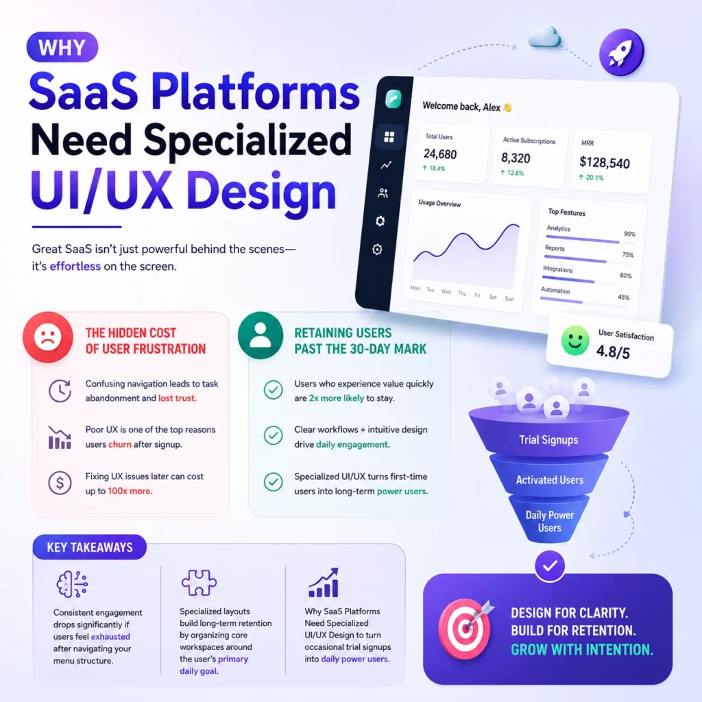
SaaS applications require specialized design because they are complex tools meant for repetitive daily utility, not simple promotional websites. Learn why you need a specific UI/UX design for SaaS platforms to retain users and create adoption. If a user cannot figure out how to generate a report within sixty seconds, your subscription retention rate drops to zero. Standard agencies build pretty pages, but specialized design handles state changes, complex permissions, and data manipulation.
The Hidden Cost of User Frustration
User frustration acts as a silent tax that bleeds your monthly recurring revenue through high churn and massive support queues. When enterprise software forces workers to click five times for a simple task, efficiency plummets and management cancels the contract. A bad interface forces your customer support team to act as manual tour guides for basic features.
Retaining Users Past the 30-Day Mark
Retaining users past the critical thirty-day milestone requires a product interface that transforms novelty into an integrated daily habit. The initial excitement of a new software tool fades instantly if the workspace feels cluttered or slow. Your product must showcase immediate utility to prove its ongoing monthly cost to the CFO.
Key Takeaways:
- Consistent engagement drops significantly if users feel exhausted after navigating your menu structure.
- Specialized layouts build long-term retention by organizing core workspaces around the user’s primary daily goal.
- Why SaaS Platforms Need Specialized UI/UX Design to turn occasional trial signups into daily power users.
Key Features of a High-Converting SaaS UI/UX Design
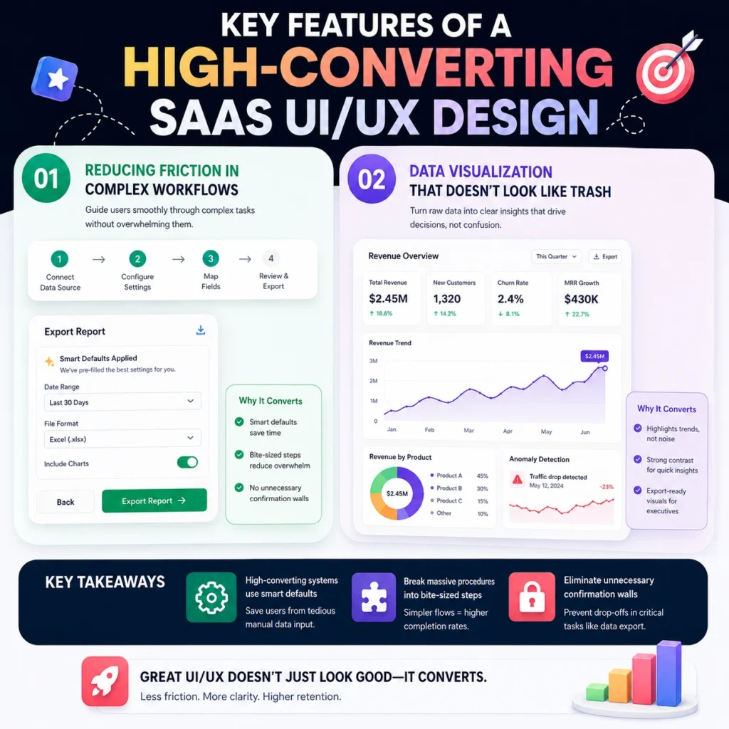
High-converting software design prioritizes data clarity and intuitive user journeys to drive immediate expansion revenue and account upgrades. A clear interface guides users toward premium upgrades without interrupting their natural workflow with annoying pop-ups. Conversion is about removing roadblocks from the path of the person trying to execute a task.
Reducing Friction in Complex Workflows
Reducing friction requires stripping away unnecessary steps, form fields, and confusing confirmation dialogs from your application’s core actions. If an administrative user needs to configure an integration, the process must feel like a guided conversation. When you remove cognitive load, you instantly increase the speed of customer task completion.
Key Takeaways:
- High-converting systems use smart defaults to save users from tedious manual data input.
- Key Features of a High-Converting SaaS UI/UX Design focus on breaking massive procedures into bite-sized steps.
- Eliminating unnecessary confirmation walls prevents users from abandoning critical data export tasks mid-way.
Data Visualization That Doesn’t Look Like Trash
Data visualization must present complex analytics in a clear, digestible layout that tells an actionable story at a single glance. Flooding a dashboard with twenty different conflicting neon bar charts creates confusion rather than delivering actionable business intelligence. Clean data presentation focuses on high contrast and logical information grouping.
Key Takeaways:
- Key Features of a High-Converting SaaS UI/UX Design demand that charts highlight trends rather than raw data dumps.
- Proper color contrast allows users to spot system anomalies instantly without squinting at grids.
- Good data design allows executives to export clean charts directly into corporate slide decks.
How to Choose a UI/UX Design Agency for SaaS Products

Choosing the wrong agency means paying a premium for superficial mockups that completely fall apart during production engineering. You must avoid partners who only display static graphic design portfolios without showing functional, interactive product systems. A competent team talks about user metrics, retention rates, and engineering constraints rather than abstract artistic theories.
Portfolios to Avoid: Pretty Visuals vs. Functional Systems
Avoid portfolios filled with overly polished screenshots that hide the actual reality of complex software user flows. Many agencies display concept designs that look fantastic on a social media feed but fail under real-world data conditions. You need to see how they handle crowded tables, error messages, and complex user permission settings.
Key Takeaways:
- Look for interactive prototypes that simulate real user paths over static image files.
- How to Choose a UI/UX Design Agency for SaaS Products depends on checking their past software case studies.
- Avoid agencies that cannot show a direct correlation between their design choices and client growth metrics.
Asking the Hard Questions Before Signing
Force your potential agency partner to explain how they handle unexpected technical constraints and complex developer handoffs. Ask them to walk you through an instance where user feedback completely broke their initial design assumptions. If they claim their first ideas are always perfect, terminate the meeting immediately.
Key Takeaways:
- Demand to see their documentation process for state changes, edge cases, and empty dashboard screens.
- How to Choose a UI/UX Design Agency for SaaS Products requires knowing if they test layouts with real users.
- High-quality agencies explain their design decisions using behavioral psychology rather than subjective personal tastes.
UI/UX Design Process for SaaS Platforms
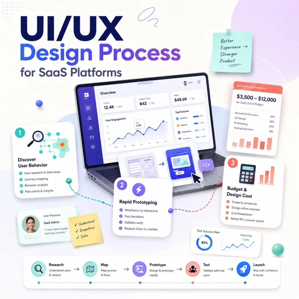
An efficient UI/UX design process for SaaS platforms eliminates guessing by anchoring every single layout decision in actual user behavior data. This structured workflow transforms chaotic feature requests into a clean, predictable development map that prevents engineering waste. Skipping these fundamental steps guarantees you will spend double the budget rewriting bad code later.
Discovery and Mapping User Behavior
Discovery requires analyzing exactly how your customers interact with your application to uncover the hidden friction points causing churn. You must watch real people struggle with your menu navigation to understand where the current layout fails. Mapping these journeys prevents your team from building features that nobody actually wants or uses.
Key Takeaways:
- The UI/UX design process for SaaS platforms always starts with raw user session observation data.
- Creating accurate user maps keeps the entire product team aligned on the primary customer goals.
- Identifying core workflow bottlenecks tells your team exactly which screens require immediate layout redesigns.
Prototyping Without the Corporate Delay
Prototyping means building low-fidelity interactive wireframes to test functional ideas rapidly before writing a single line of production code. This approach allows you to iterate on user feedback in hours rather than spending weeks in slow corporate committee meetings. If you find an interface flaw during wireframing, you save thousands in development hours.
Key Takeaways:
- Interactive prototypes allow marketing and engineering to validate product flows simultaneously.
- The UI/UX design process for SaaS platforms uses fast prototyping to kill bad layout ideas early.
- By the way, FlowmazeUX fixes these structural layout flaws before your engineering team touches the code.
Cost of UI/UX Design for SaaS Platforms
The cost of UI/UX design for SaaS platforms varies widely based on scope, but treating it as a cheap administrative expense is a recipe for product failure. You can hire budget freelancers to slap together generic templates, or you can invest in an agency that understands software business models. Cutting corners on your product interface simply kicks the financial burden down the road to your customer success team.
Cheap Design Costs Double to Fix Later
Cheap design is an illusion that ends up costing double once your engineering team tries to implement broken user flows. When a low-budget designer ignores system edge cases, your developers waste hundreds of billable hours trying to bridge the structural gaps. You end up paying to completely rebuild the product interface from scratch within six months.
Key Takeaways:
- Budget design assets rarely account for complex state changes, empty states, or error handling loops.
- Cost of UI/UX Design for SaaS Platforms must include the long-term price of engineering rework.
- Investing upfront prevents your software from looking like an amateur hobby project to enterprise buyers.
Calculating the ROI of Product Optimizations
Calculating your return on design investment requires looking directly at customer activation timelines, support ticket volumes, and trial conversion rates. When a layout optimization cuts the time-to-value in half, your client acquisition cost drops immediately. A small reduction in user churn yields massive compounding revenue increases over a single fiscal year.
Key Takeaways:
- Higher user activation rates mean your marketing spend converts into actual monthly recurring revenue.
- The cost of UI/UX Design for SaaS Platforms scales alongside the measurable business metrics they optimize.
- Clear visual layouts directly lower the volume of basic usability questions hitting your support queue.
Common UI/UX Mistakes in SaaS Platforms
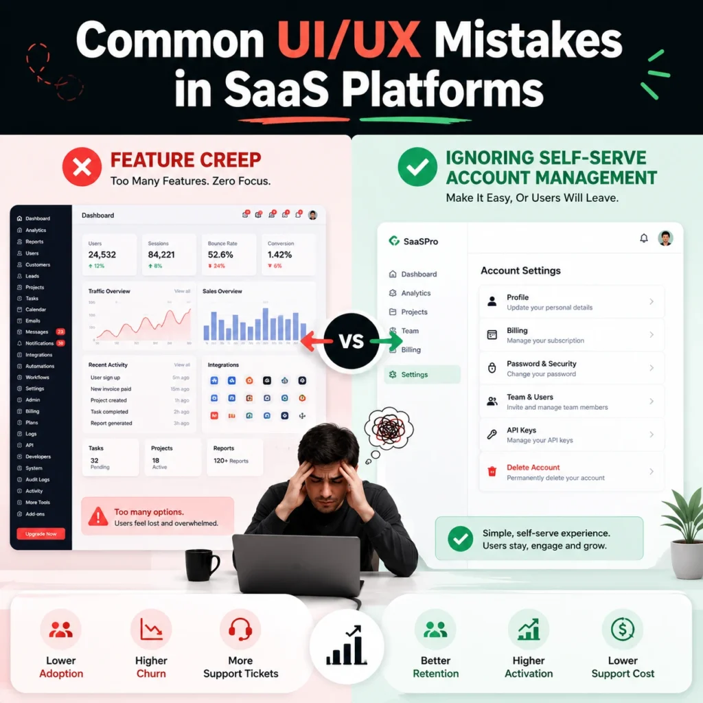
Most software engineering teams make common UI/UX mistakes in SaaS platforms by prioritizing raw technical features over clean information architecture. They pack the main dashboard with every tool imaginable, assuming users want maximum complexity on a single screen. This bad habit creates an intimidating wall of options that scares away new trial signups instantly.
Feature Creep vs. Clean Interfaces
Feature creep happens when product teams add endless niche buttons to the workspace without considering the overall cognitive load on the user. A clean interface hides advanced configurations under contextual menus, keeping the primary workspace completely focused on core daily tasks. Your application should guide the user naturally rather than shouting everything at once.
Key Takeaways:
- Jamming every new feature onto the main screen destroys the overall visual hierarchy of the application.
- Common UI/UX Mistakes in SaaS Platforms include letting engineering logic dictate the consumer design layout.
- Progressive disclosure keeps your interface approachable for beginners while remaining powerful for advanced users.
Ignoring Self-Serve Account Management
Ignoring self-serve account management forces your premium clients to email support just to update a credit card or add a teammate. When basic administrative tasks require human intervention, you create unnecessary friction that irritates decision-makers. The billing and settings panels require the same design care as your primary product features.
Key Takeaways:
- Clunky billing interfaces actively trigger buyers to reconsider their monthly subscription costs during updates.
- Common UI/UX Mistakes in SaaS Platforms often involve treating settings pages as a secondary afterthought.
- Simple self-serve options reduce corporate administrative friction and improve long-term client satisfaction scores.
SaaS Dashboard Design Best Practices
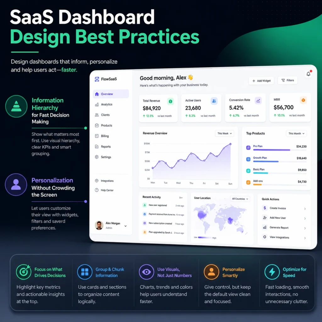
SaaS dashboard design best practices focus entirely on turning overwhelming corporate data dumps into clean, actionable business intelligence. The primary dashboard is the first screen a user sees every morning, meaning it must summarize status conditions without forcing deep database searches. If your user needs to open five browser tabs to understand their daily goals, your dashboard layout has failed.
Information Hierarchy for Fast Decision Making
Information hierarchy forces the most critical business metrics to the top of the screen while pushing secondary details down the layout. Executives look at software to find anomalies, track progress, and spot sudden system failures within seconds. Organizing your elements by importance prevents users from experiencing cognitive fatigue during intensive data analysis tasks.
Key Takeaways:
- High-level summary cards give users a clear snapshot of their business health instantly.
- SaaS Dashboard Design Best Practices require placing macro trends above granular data rows.
- Proper layout spacing guides the eye naturally to critical alerts without using flashing red text.
Personalization Without Crowding the Screen
Personalization allows different team members to customize their individual workspaces without cluttering the underlying application code. A financial officer needs to see revenue charts, while a customer support manager requires immediate access to open ticket queues. Your interface must adapt to these distinct operational roles smoothly.
Key Takeaways:
- Role-based workspace configurations hide irrelevant features from users who do not need them.
- SaaS Dashboard Design Best Practices dictate that custom layouts must remain clean and structured.
- Letting users save their favorite shortcuts improves daily workflow efficiency across large teams.
Onboarding UX for SaaS Applications
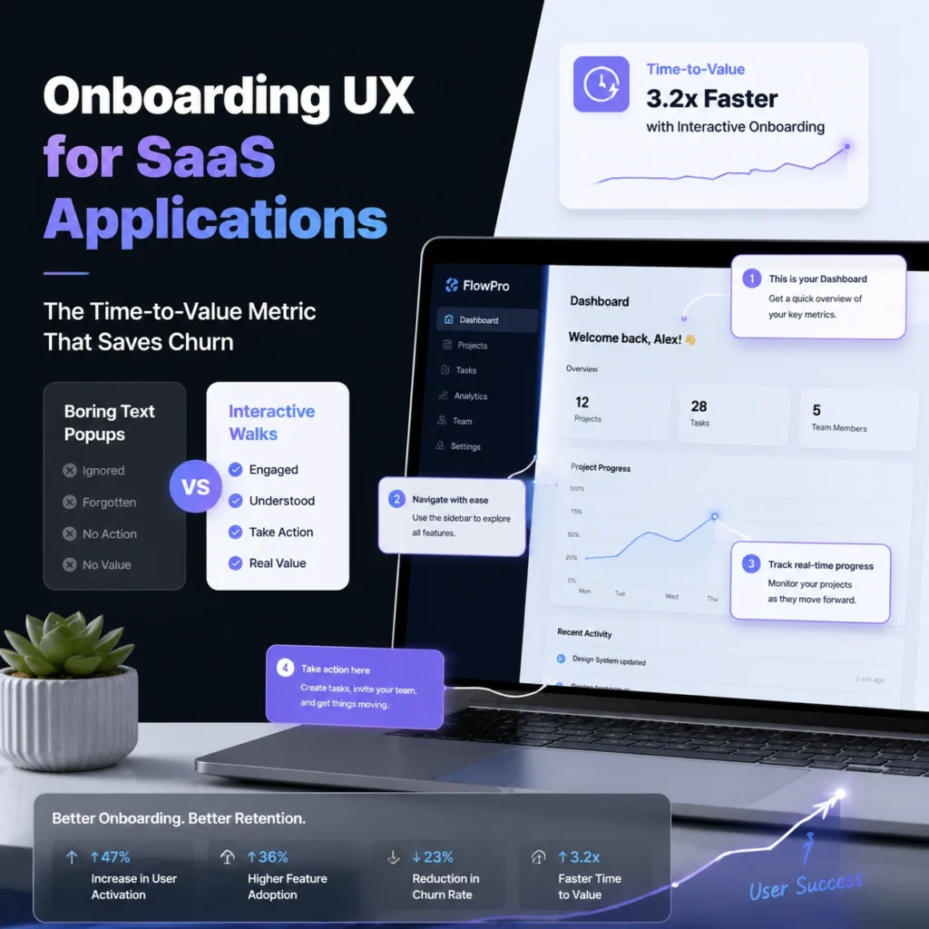
Onboarding UX for SaaS applications determines whether a new trial user stays long enough to buy or quits out of sheer frustration. A terrible onboarding experience treats new signups like expert users, forcing them into an empty dashboard with no guidance. Your software must hold their hand through the initial configuration to prove its immediate financial value.
The Time-to-Value Metric That Saves Churn
The time-to-value metric measures the exact number of minutes it takes a new customer to achieve their first success inside your application. If a user has to read a massive help document before seeing results, they will cancel their account immediately. Your layout must guide them to that initial win as fast as humanly possible.
Key Takeaways:
- Onboarding UX for SaaS Applications focuses on dropping the time-to-value metric down to minutes.
- Fast initial setup experiences prevent users from abandoning the product during the first session.
- Stripping out non-essential registration questions keeps users moving toward the core application features.
Interactive Walks over Boring Text Popups
Interactive walkthroughs teach users how to operate software by forcing them to complete real tasks rather than making them read long text boxes. Clicking through five consecutive generic modal popups is boring, and users skip them without learning anything. Guided actions build muscle memory and show people how the interface functions in real time.
Key Takeaways:
- Contextual tooltips appear only when a user interacts with a specific new feature.
- Onboarding UX for SaaS Applications uses real micro-tasks to educate users instead of static videos.
- For instance, FlowmazeUX engineers smooth onboarding flows that turn trial signups into immediate brand advocates.
Case Study: How UI/UX Improved SaaS Product Growth
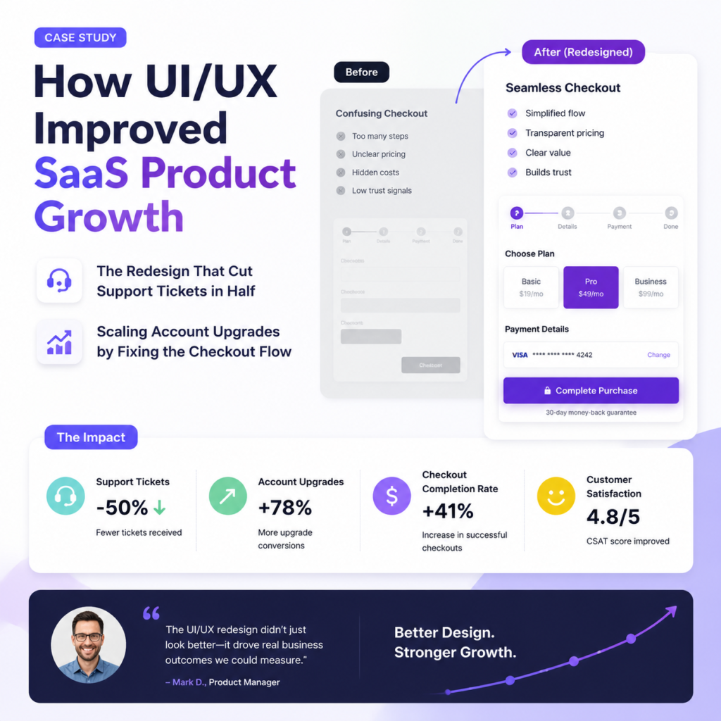
Analyzing a case study: how UI/UX improved SaaS product growth reveals that data-driven interface updates generate massive compounding revenue increases. Most struggling software platforms can trace their slow growth directly to hidden friction points inside their core conversion loops. Fixing these layout mistakes unblocks your sales pipeline and allows marketing campaigns to convert efficiently.
The Redesign That Cut Support Tickets in Half
A major project management platform cut its customer support volume drastically simply by reorganizing its complex project creation page. Users were constantly submitting tickets because the old layout hid the save button below the screen fold on smaller laptops. Repositioning the main action buttons saved the support team hundreds of hours of manual troubleshooting.
Key Takeaways:
- Fixing basic button placement errors frees up engineering resources to build actual product updates.
- A Case Study: How UI/UX Improved SaaS Product Growth always highlights drop-offs in customer complaints.
- Clean navigation paths allow enterprise clients to manage large accounts without contacting account managers.
Scaling Account Upgrades by Fixing the Checkout Flow
An analytics tool unlocked major expansion revenue by integrating account upgrade prompts directly into the user’s natural workflow limitations. Instead of blocking the screen with aggressive popups, they placed clear contextual up-sell buttons right next to locked premium features. This subtle shift made upgrading feel like a helpful choice rather than an annoying sales pitch.
Key Takeaways:
- Smooth checkout transitions prevent users from rethinking their financial decisions during account upgrades.
- A Case Study: How UI/UX Improved SaaS Product Growth shows how micro-copy tweaks boost conversions.
- Transparent pricing presentation inside the application builds buyer trust and accelerates procurement decisions.
Fix Your Trash UX or Keep Losing Cash

Fixing your software product interface is not a luxury project you delay until next fiscal year. It is the core driver of your user retention, account upgrades, and overall valuation metrics. When an application feels heavy or confusing, customers leave for a competitor that values their time. If your growth charts are flat, stop blaming your sales team and look at your dashboard navigation instead.
The FlowmazeUX Edge
- We drop complex corporate jargon to focus entirely on user retention and product engagement metrics.
- Our design deliverables arrive fully documented for your engineering team to prevent development delay.
- We strip away visual clutter to ensure your clients find value inside your application immediately.
FlowmazeUX functions as a specialized product layout powerhouse that cuts through standard agency bureaucracy to deliver high-velocity, high-converting digital assets. We do not do vague creative brainstorms or build pretty interfaces that break during development handoffs. We analyze user data, optimize time-to-value metrics, and build a ruthless UI/UX design agency for SaaS platforms and frameworks designed to convert.
Frequently Ask Questions
SaaS applications are repetitive daily utilities that manage complex data states, requiring custom functional frameworks rather than basic website layouts to keep users engaged.
High-converting design relies on clear information hierarchy, smart defaults, and intuitive contextual navigation paths that guide users toward core actions without friction.
You must skip teams that only display static screenshots and instead select agency partners who show functional, interactive prototypes backed by hard user metrics.
The process maps real user behavior trends, builds rapid interactive wireframes, and runs usability testing loops to validate layouts before writing production code.
Pricing scales with product workflow complexity and scope, but choosing a cheap design inevitably ends up costing double once you factor in engineering re-work.
You fix them by aggressively removing feature creep, utilizing progressive disclosure for advanced settings, and building intuitive self-serve account dashboards.
Best practices require organizing data by business importance, highlighting actionable anomalies, and allowing role-based personalization without crowding the main workspace.
Onboarding determines your initial customer churn, meaning your interface must guide new trial signups to their first successful software action within minutes.