
Building a successful subscription software product requires moving far beyond clean aesthetics or trendy dark modes. The foundational UI/UX design process for SaaS platforms must function as a data-driven framework dedicated to lowering cognitive friction, accelerating time-to-value, and protecting recurring revenue.
Unlike static websites, complex web applications operate as living digital ecosystems where a single confusing layout choice can immediately destroy customer expansion opportunities. To build a product that stands out in a highly competitive market, development teams must treat interface structure as a continuous, systematic science rather than a one-time aesthetic layout task.
If you want to understand how expert teams execute this at scale, explore our Professional UI/UX Design Agency for SaaS Platforms
5 Phases of the Core Product Development Loop
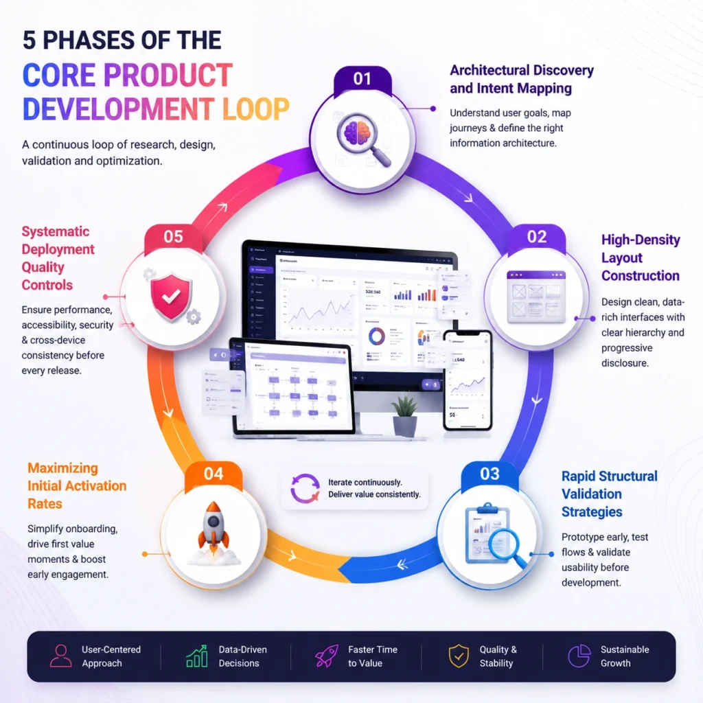
1. Architectural Discovery and Intent Mapping
Before touching a single vector point or choosing a corporate brand palette, your product team must completely decode how a target user expects information to flow. Executing thorough user journey mapping helps plot out every structural decision, micro-interaction, and potential friction point an administrator encounters from their very first login.
This phase relies on gathering detailed contextual research to uncover the exact operational headaches that cause corporate teams to abandon legacy software. Mapping these pathways highlight your product layout addresses specific workplace frustrations rather than relying on abstract assumptions about customer behavior.
2. High-Density Layout Construction
Enterprise software users routinely process vast amounts of complex operational data, meaning that chaotic visual structures will quickly lead to cognitive fatigue. Mastering intricate B2B dashboard design requires utilizing clear hierarchy principles, such as progressive disclosure, where high-level metrics sit prominently at the surface while granular filtering tools stay hidden until explicitly clicked.
Look at industry leaders like Stripe; their primary analytical views display high-level volume and dispute rates instantly, leaving deeper ledger tracking for subsequent sub-menus. Keeping primary data fields cleanly organized prevents users from feeling overwhelmed by heavy data tables.
3. Rapid Structural Validation Strategies
Transforming abstract product concepts into clickable and interactive layouts allows engineering teams to test system logic. This happens before spending heavy development resources on production code.
Reviewing diverse SaaS wireframe examples helps establish layout structure. It defines where primary navigation menus, action buttons, and contextual alert bars should be placed across the web application interface.
Moving these low-fidelity structures into advanced Figma prototyping tools allows designers to simulate complex user behaviors, run remote usability audits, and uncover navigation bottlenecks early. Validating structural flows at this stage protects your engineering pipeline from expensive, late-stage code adjustments.
4. Maximizing Initial Activation Rates
The long-term survival of a subscription platform depends heavily on what happens during a customer’s first five minutes inside the application interface.
Refining the user onboarding experience involves removing non-essential configuration steps. It also includes eliminating forced introductory tours. The goal is to guide users directly toward their first meaningful product victory.
Instead of presenting blank default states, populate empty workspaces with helpful interactive sample data or clear setup checklists that prompt immediate action. Implementing interactive onboarding checklists can boost early feature activation rates by up to 35% within the first month of deployment.
5. Systematic Deployment Quality Controls
Launching a software update without checking cross-device compatibility or sensory layouts is a recipe for immediate user frustration. Utilizing a strict, multi-point UI UX checklist helps design teams verify font legibility ratios, button hover states, focus states, and overall responsive grid alignments before pushing code to production servers.
This final verification gate confirms that your application provides a completely stable and accessible experience for every single user. It ensures compatibility across all hardware types and screen resolutions.
Locking in these precise layout details protects the core usability of your product. It also prevents unexpected drops in daily active user engagement.
Ready for Product Growth Through Strategic Iteration?

Continuous, data-driven optimization remains the defining characteristic of elite software products that command massive market valuations. The median annual customer retention rate for top-performing B2B platforms hovers around 90%, proving that product usability directly dictates financial health.
Visualises the SaaS UI/UX design process and features ready for product growth through strategic iteration. This demonstrates a structured growth cycle supported by analytics dashboards and performance tracking and emphasises iterative product improvement. It shows how SaaS platforms evolve through constant optimisation, data-driven decisions, and bettering the product for the user. This leads to scalable growth and better user engagement.
For full UI/UX transformation support, visit our UI/UX Design Services
Choose FlowmazeUX Today!
FlowmazeUX pairs deep technical user research with rapid prototyping systems to remove user drop-off points completely. We integrate seamlessly alongside your product engineering squad, helping your company secure market dominance through sharp, low-friction digital design execution.
Frequently Ask Questions
Mapping out your user journeys exposes unexpected point-of-use friction, helping teams fix navigation roadblocks that otherwise lead to user frustration and subscription cancellations.
Dashboards must prioritize high-level key performance indicators above the fold, implement progressive disclosure for complex data layers, and provide clean export tools for outside stakeholders.
Designers can study production layouts on specialized product directories like Mobbin or analyze open design systems inside public community spaces to find verified layout patterns.
Teams must check color contrast accessibility minimums, verify keyboard navigation flow pathways, test form validation error states, and confirm layout flexibility across multiple screen sizes.
They allow designers to deliver exact component properties, reveal pixel-perfect spacing specs, and showcase precise micro-interaction styles, which cuts down on development interpretation errors.
Remove mandatory multi-step introduction videos, eliminate empty default dashboard states, and introduce interactive, reward-driven setup checklists that lead users to core features quickly.
A comprehensive review becomes vital when application feature adoption rates drop, customer acquisition costs rise, or your user support desk gets flooded with basic navigation complaints.
By embedding cross-functional reviews early, utilizing shared tokens inside a global design system, and running continuous usability checks throughout the entire implementation process.