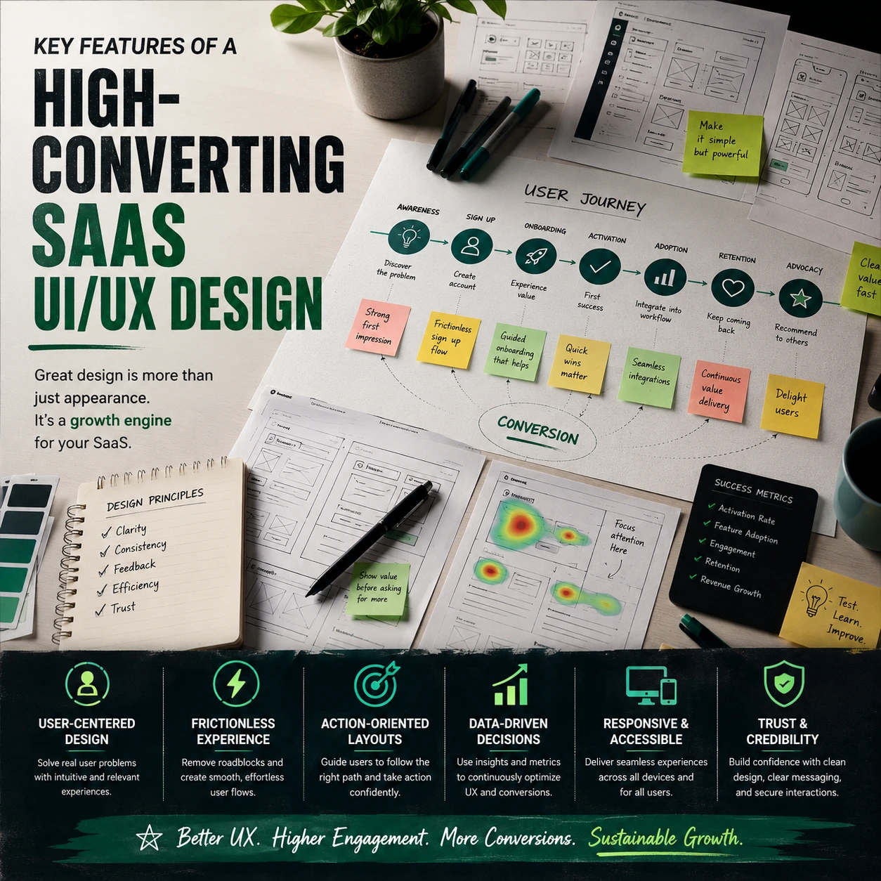
Most software businesses regard optimisation as a marketing problem, spending money to change the colour of a landing page button while neglecting the huge user graveyard buried immediately behind the login screen. If your application requires heavy manual training sessions only to teach a user how to perform a simple daily task, its architecture is faulty.
High converting SaaS UI/UX design isn’t about designing a slick software workspace for creative mood boards. It’s about removing the systemic mechanical hurdles preventing an active trial user from realising your solution is really critical to their daily company operations. To delve further, read our pillar guide on Professional UI/UX Design Agency for SaaS Platforms and understand how skilled design eliminates friction and boosts user activation.
15 Critical Elements That Turn Software Into a Retention Machine
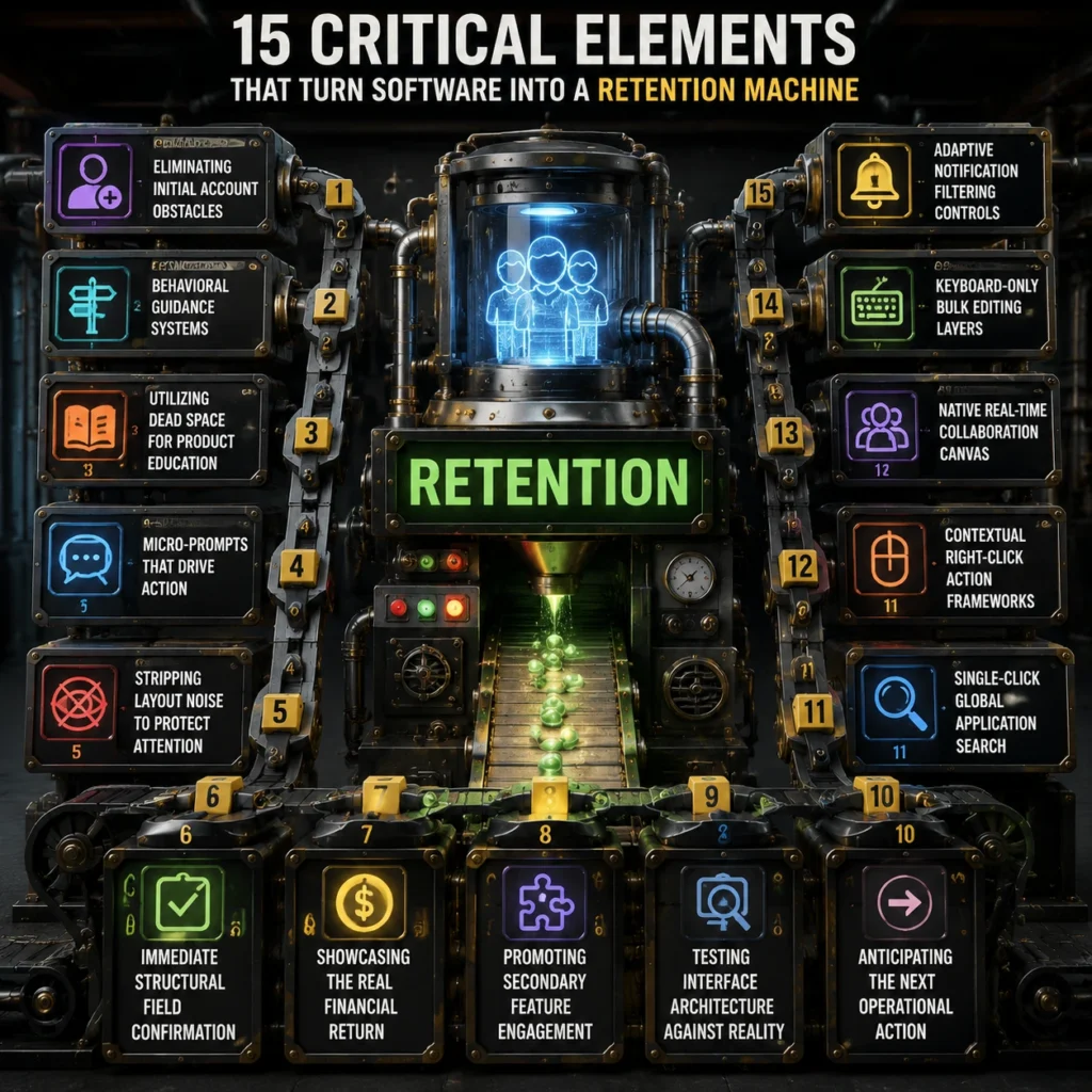
1. Eliminating Initial Account Obstacles
The quickest way to destroy your customer acquisition budget is to force a fresh signup to fill out a thirty-field profile questionnaire before they ever glimpse your workspace dashboard. High-performing products utilize frictionless registration flows that ask for the absolute bare minimum data required to spin up a secure, functional cloud instance. By deferring deep identity configuration until the user actually encounters a feature that requires those specific variables, you keep their momentum high and protect your early activation velocity.
Implementing frictionless registration flows ensures that curious trial leads spend their first sixty seconds interacting with your core utility rather than suffering through administrative password configuration loops.
2. Behavioral Guidance Systems
Dumping a user into a massive data dashboard with a giant, generic welcome pop-up is a lazy approach to product onboarding. Instead, modern interfaces deploy contextual onboarding loops that respond dynamically to what the operator is attempting to click in real time. If a user enters your analytics terminal for the first time, the interface should surface a subtle, single-step hint explaining exactly how to upload their initial database file.
These targeted contextual onboarding loops act as an invisible product consultant, keeping people moving forward without breaking their natural focus or disrupting their operational workflow with annoying full-screen videos.
3. Utilizing Dead Space for Product Education
Blank slate screens are a massive visual liability that usually results in immediate account abandonment. When a customer clicks into a fresh account overview page, they are frequently met with an unhelpful message stating that no data exists yet. Expert product engineering designs intentional, interactive empty-states that turn these blank screens into proactive setup assistants.
An effective application uses intentional interactive empty-states to provide pre-loaded sample data templates or quick-start action buttons that show the operator exactly what the screen will look like once their team is fully integrated into the system.
4. Micro-Prompts That Drive Action
Vague tooltips and generic label buttons like “Submit” or “Continue” do absolutely nothing to alleviate the natural anxiety a user feels before executing a major system command. High-converting frameworks rely on microcopy conversion triggers placed directly adjacent to high-impact click zones. This means changing a generic upgrade button to a precise prompt like “Unlock unlimited automated invoicing to save 5 hours this week.”
These calculated microcopy conversion triggers address the user’s immediate operational objective, completely eliminating any hesitation before they click to activate an advanced premium tool.
5. Stripping Layout Noise to Protect Attention
When every toggle button, flashing alert and side-tab vies for attention, consumers suffer decision paralysis.
Elite enterprise programs lower the cognitive load by hiding secondary configuration options behind contextual utility menus.
By ruthlessly executing cognitive load reduction throughout your layout, you allow operators to execute core daily procedures without forcing their eyes to sift through hundreds of unrelated data points. This spatial discipline transforms an intimidating technical interface into a surprisingly relaxing workspace that employees actively prefer using.
6. Immediate Structural Field Confirmation
There is nothing more frustrating than spending ten minutes filling out a complex data submission table only to hit save and watch the entire screen refresh with a generic error message.
High-converting platforms prevent this systematic friction by incorporating dynamic visual validation directly into every input component. As the operator inputs alphanumeric strings, the form utilizes dynamic visual validation to confirm formatting accuracy, password strength, or domain availability instantly.
This immediate feedback loop catches structural typing mistakes on the fly, allowing users to make real-time corrections before attempting a final database save.
7. Showcasing the Real Financial Return
If a corporate buyer cannot clearly see how your software saves them time or money, your application will be the very first line item cut during the next quarterly budget review. Top-tier enterprise platforms integrate continuous value metric tracking directly into the main navigational framework of the account workspace. This means designing a dedicated corner of the application layout that constantly calculates metrics such as total hours saved, automated tasks completed, or extra revenue captured.
This constant value metric tracking acts as a silent renewal engine, proving to the executive sponsor every single day that your product is a profitable asset rather than an unhelpful software expense.
8. Promoting Secondary Feature Engagement
Software solutions often have a low customer lifetime value since members only know around 10 percent of the things they pay for.
Smart interfaces offer subtle, non-intrusive in-app feature discovery routes that suggest enhanced utilities based on the user’s existing workflow.
If a system detects that a user is manually exporting a CSV file every Friday morning, it can trigger an inline suggestion showing them how to configure an automated API integration instead. This targeted in-app feature discovery deepens the user’s technical reliance on your ecosystem, turning basic trial users into long-term product advocates.
9. Testing Interface Architecture Against Reality
Industry data confirms that fixing basic structural navigation flaws via usability testing can boost product task completion speed by up to 135%. Designers love to create beautiful, hyper-minimalist software layouts that look stunning on a giant creative monitor but completely break the moment a real human tries to execute an enterprise task.
True conversion engineering demands constant heuristic usability validation to measure how easily an average worker can navigate your system without getting stuck. Heuristic usability validation systematically exposes where your layout breaks common mental models. It also lets you adjust confused symbol buttons and malfunctioning navigation flows before they impair core activation statistics.
10. Anticipating the Next Operational Action
Clunky software forces users to click backward and forward through multiple nested dashboards just to complete one multi-step task. High-converting systems predict the next logical action and place buttons right where the user’s cursor is hovering.
If a customer has done a monthly invoice generation, the interface should immediately offer a main action button to email it. Discover how a SaaS UI/UX Design Agency builds predicted interaction routes that boost activation and lower friction. Seamless predictive interaction paths mean that consumers don’t have to think about the next step. It makes for a seamless workflow. Legacy systems seem slow.
11. Single-Click Global Application Search
The pace at which the modern business professional works is rapid. They don’t have time to flip through many workspace tabs to discover a client document or transaction log.
High-converting platforms integrate a permanent, global search bar right at the top of the application framework that scans the entire database in milliseconds. This interface component gives users immediate access to files, individual team profiles, and deep system settings from any screen inside the product, eliminating navigational guesswork.
12. Contextual Right-Click Action Frameworks
Dragging a mouse over a large monitor slows down everyday workflows, for instance. It’s taking longer than it should for simple things like changing or removing records.
Specialized application layouts unlock contextual right-click drop menus that surface relevant operational controls directly at the point of interaction. Data specialists can manage rows, modify permissions, or trigger automations without leaving their current workspace view. This keeps their focus intact and allows them to work efficiently without navigating away.
13. Native Real-Time Collaboration Canvas
Software no longer exists in a vacuum. Leaving your application to communicate on external chat solutions adds extra friction and increases the attrition risk for your workforce.
High utility interfaces embed cooperation into the work space. Team members can remark, assign and tag colleagues without leaving the live data environment. This keeps communication centralised and workflows smooth.
This native connectivity transforms your standalone utility into a core communication hub for the client’s entire department.
14. Keyboard-Only Bulk Editing Layers
Power users with vast inventories or financial records don’t want to wait for slow mouse clicks. The software offers bulk selection, so they can update multiple data cells in one go.
It also enables keyboard-only workflows, allowing operators to rapidly change hundreds of entries using ordinary command keys. This cuts down on friction and speeds up everyday activities.
Providing this high-velocity operational layer keeps your core technical audience incredibly satisfied and prevents them from reverting to legacy spreadsheets.
15. Adaptive Notification Filtering Controls
Recent product telemetry reveals that letting users filter out non-essential system alerts reduces overall workspace anxiety and increases daily active app engagement by 44%.
Dumping fifty unorganized system alerts on a user’s dashboard each morning creates immediate visual exhaustion. As a result, users often mute notifications entirely, missing critical updates. High-converting SaaS systems build an intelligent notification center that automatically groups alerts by operational priority and department relevance.
Stop Letting Poor Execution Tank Your Valuation Metrics
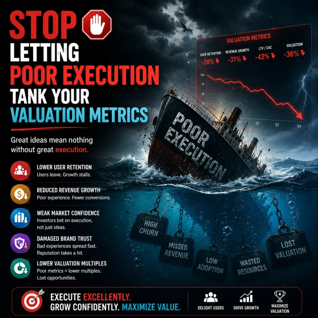
Relying on an unoptimized, clunky software layout is an expensive way to run a tech company.
- If your offering requires a massive library of training DVDs, buyers are going to struggle to find value on their own. Another red indicator is if your customer success team is always having to step in.
- The product we are building should be intuitive. If you have to constantly handhold trial consumers so they don’t cancel, you’re running an expensive software training camp.
- High-converting SaaS UI/UX design is a financial multiplier that transforms raw development code into a self-service customer acquisition machine.
- Your layout is designed for human psychology and operational speed, thus activation numbers will automatically improve.
- Your sales team may then focus on closing corporate deals and not on resolving interface misunderstanding.
What is the FlowmazeUX Process?
FlowmazeUX is the tactical engineering and design team that kills product friction without the typical creative agency nonsense. See how collaborating with a Professional UI/ UX Design Agency for SaaS Platforms may convert your trial users into devoted daily product supporters. We do not waste your time with abstract design workshops or lengthy, non-committal theoretical presentations. We get into your app and aggressively audit user drop-offs. Then we use high-converting layout frameworks to drive product feature adoption. For a full list of services and actionable solutions, visit our SaaS UI/UX services page.
Frequently Ask Questions
Prioritizing frictionless registration flows ensures that new trials access your application instantly, maximizing early product interaction before user drop-off occurs.
Contextual onboarding loops deliver short, highly relevant system hints exactly when a user attempts an action, teaching them your system mechanics without disrupting their real work.
Intentional interactive empty-states use pre-loaded mock data and clear action buttons to show users exactly how to use a workspace rather than leaving them staring at a confusing white page.
Microcopy conversion triggers replace boring button text with explicit descriptions of the real-world value the user gains, removing anxiety right at the point of purchase.
Enforcing systematic cognitive load reduction strips non-essential visual elements out of the workspace, preventing the mental fatigue that drives users to abandon complicated platforms.
Dynamic visual validation flags structural formatting mistakes instantly while the operator is typing, eliminating the frustration of failed form submissions and broken data re-entry.
Value metric tracking automatically displays concrete financial and time-saving ROI directly inside the application menu, giving corporate buyers a permanent reason to renew their contracts.
Running heuristic usability validation tests your product layout against proven behavioral principles, ensuring your workspace matches human psychology rather than just looking pretty on a screen.