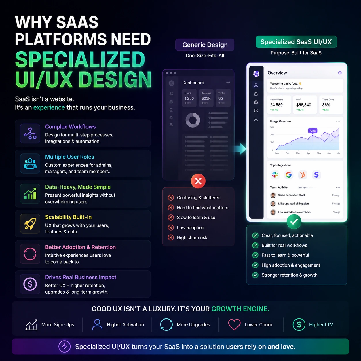
Hiring a generic agency that builds flashy marketing sites to design your cloud software is like asking a house painter to engineer a fighter jet. Software is not a static brochure. It is a highly interactive workbench where users spend eight hours a day trying to complete complex tasks under tight deadlines. When your product workflow feels like a frustrating math test, subscribers cancel their accounts and buy from your competitor. You do not need artistic decoration. You need specialized UI/UX design to handle complex user permissions, endless data tables, and dense analytical configurations. Looking for professional SaaS design support? Check out our full guide to Professional UI/UX Design Agency for SaaS Platforms, including how some firms increase usability, retention, and product growth.
Structural Reasons Your App Is Failing Without It
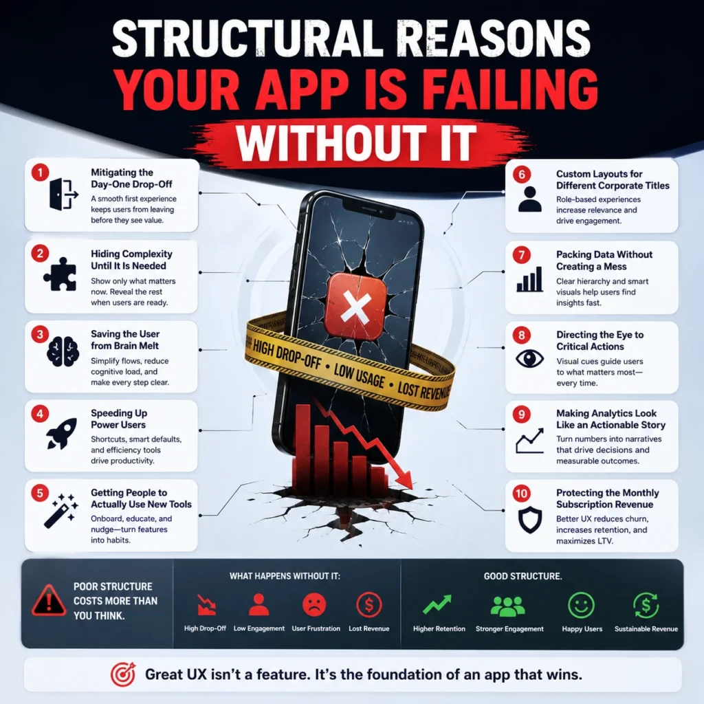
1. Mitigating the Day-One Drop-Off
Software applications lose over 70% of their trial signups on the very first day because the interface looks like an intimidating void. If a new user logs in and encounters a blank white screen with zero direction, they will immediately log out and never come back. Specialized UI/UX design solves this immediate drop-off by building frictionless onboarding flows that guide people to their first small operational win within minutes.
- Frictionless onboarding flows remove unnecessary configuration steps from the initial registration screen.
- Your software must showcase its core financial or operational utility before asking users to complete an extensive profile setup.
- Building frictionless onboarding flows means treating the beginner with extreme care while keeping the setup pace incredibly fast.
2. Hiding Complexity Until It Is Needed
Jamming every advanced setting onto a single control panel turns your workspace into an unreadable mess that scares away average business users. True software design expertise utilizes progressive disclosure workflows to keep the primary view incredibly clean while keeping advanced configurations easily accessible under contextual menus. This prevents the interface from shouting twenty different options at someone who only wants to complete one simple weekly report.
- Progressive disclosure workflows hide secondary action items behind clean toggle menus and interactive dropdowns.
- Implementing progressive disclosure workflows prevents beginner users from feeling overwhelmed by enterprise capabilities.
- By focusing on progressive disclosure workflows, you maintain a clean application aesthetic without sacrificing deep technical functionality.
3. Saving the User from Brain Melt
Every unnecessary click, unaligned button, and random pop-up message adds a heavy layer of mental fatigue to your customer’s workday. Good application architecture focuses on cognitive load minimization to keep users relaxed, focused, and efficient while interacting with massive amounts of system information. When you clear the mental roadblocks out of the application layout, task completion speeds skyrocket instantly.
- Cognitive load minimization requires stripping away non-essential visual elements that distract from the main user task.
- Enforcing cognitive load minimization principles indicates that your software feels smooth rather than chaotic.
- A product built around cognitive load minimization stops users from submitting angry support tickets out of pure UI confusion.
4. Speeding Up Power Users
Your daily power users do not want to hunt through five nested sidebars just to perform a repetitive action they execute forty times a day. Enterprise systems need command palette navigation to let advanced operators trigger complex scripts and move between screens using rapid keyboard shortcuts. If your product forces an expert to rely entirely on slow mouse clicks, you are actively slowing down their professional output.
- Command palette navigation transforms your software into a high-speed workstation for corporate power users.
- Integrating command palette navigation allows operators to search system features without lifting their hands from the keyboard.
- Applications that neglect command palette navigation eventually lose their core technical audience to faster alternatives.
5. Getting People to Actually Use New Tools
Engineering teams waste months building brilliant background features that end up completely ignored simply because the interface hides them in plain sight. Specialized UI/UX design introduces contextual, unobtrusive cues that naturally drive product feature adoption without resorting to annoying full-screen popups that disrupt the workflow. If users cannot see a feature during their normal daily usage, that feature does not exist to them.
- Product feature adoption metrics improve drastically when updates appear exactly when the user needs them most.
- Driving product feature adoption requires deep behavioral tracking rather than guessing what button color looks prettiest.
- Low product feature adoption is a clear sign that your internal application layout is completely disconnected from real user behavior.
6. Custom Layouts for Different Corporate Titles
A corporate executive wants high-level financial summary charts, while an entry-level specialist needs granular data tables to complete their daily task list. Forcing these completely different job descriptions to share the same default view satisfies nobody and frustrates everybody. You need role based dashboarding to automatically reshape the application layout depending on who logs into the workspace.
- Role based dashboarding reveals that data presentation matches the specific operational responsibilities of the staff member.
- Utilizing role based dashboarding keeps sensitive corporate metrics hidden from junior team members without complex code blocks.
- When you ignore role based dashboarding, your interface becomes cluttered with tools that half your users never touch.
7. Packing Data Without Creating a Mess
Enterprise platforms require extensive information density management to display thousands of active line items on a single monitor screen without creating visual chaos. Standard web designers default to massive margins and giant fonts, which forces your users to scroll endlessly just to find a single variable row. Specialized UI/UX design structures heavy data arrays into compact, perfectly aligned frameworks built for quick scanning.
- Information density management balances heavy data availability with clean, readable typeface spacing.
- Mastering information density management allows customer operations teams to track massive data sets without experiencing visual fatigue.
- Poor information density management turns complex administrative portals into a useless wall of unreadable characters.
8. Directing the Eye to Critical Actions
When everything on a dashboard is bright, bold, and highlighted, absolutely nothing stands out to the person viewing the monitor. Your software workspace needs strict visual hierarchy systems to naturally pull the user’s attention toward critical alerts, pending updates, and high-priority system approvals. If an emergency error message uses the exact same layout styling as a successful data export, operators will miss it every single time.
- Visual hierarchy systems use deliberate color contrast, sizing, and layout weight to dictate user attention paths.
- A product built without visual hierarchy systems forces users to scan the entire screen just to find the next step.
- FlowmazeUX engineers strict visual hierarchy systems that cut down user error rates and eliminate operational mistakes.
9. Making Analytics Look Like an Actionable Story
Throwing fifty random bar charts onto a page does not make your application a powerful analytics tool. Your software requires a calculated data visualization architecture to translate raw database logs into clear, actionable trends that support quick executive decision-making. Charts must highlight the exact reasons behind a sudden metric spike rather than just dumping thousands of unorganized numbers onto the screen.
- Data visualization architecture transforms confusing spreadsheet rows into clean, beautifully organized graphical overviews.
- A weak data visualization architecture forces corporate buyers to export their data into external charting tools to make sense of it.
- Investing in sound data visualization architecture makes your platform indispensable during weekly executive boardroom meetings.
10. Protecting the Monthly Subscription Revenue
At the end of the day, product layout engineering is a financial strategy designed to accelerate user churn reduction across your entire customer base. Software companies regularly spend 50% of their engineering budgets fixing entirely preventable layout blunders that drive customers away. When your application operates smoothly, customers do not look for alternatives, and your customer lifetime value increases naturally.
- User churn reduction happens when you eliminate the daily interface annoyances that build up customer resentment.
- A data-driven focus on user churn reduction protects your software company from sudden, unexpected subscription cancellations.
- Investing in specialized UI/UX design is the most direct method to stabilize your monthly recurring revenue metrics. Learn how a Professional UI/UX Design Agency for SaaS Platforms helps SaaS companies boost retention, increase product adoption & maximise recurring revenue.
Stop Pretending a Marketing Site Designer Can Fix Your Software
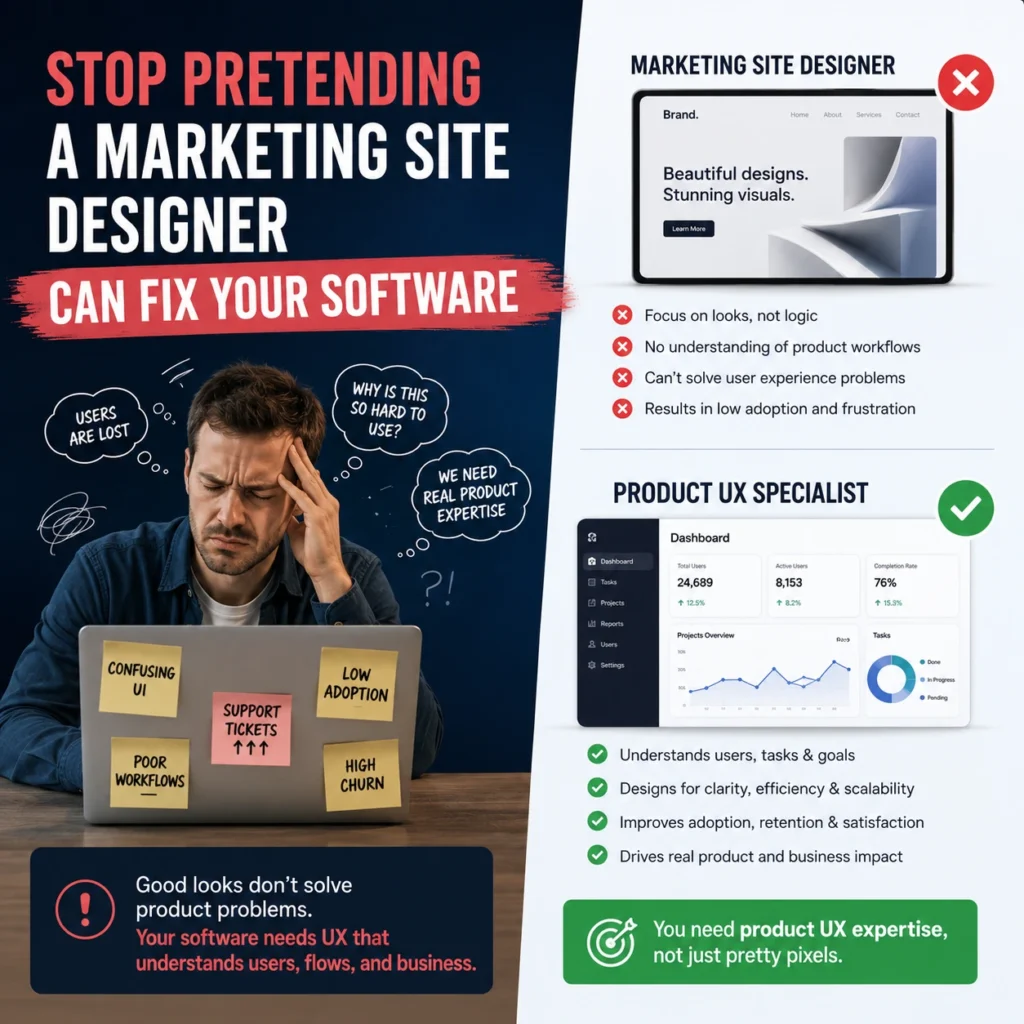
The digital market is flooded with software applications that fail simply because their founders let developers build interfaces based on engineering logic. Your internal dev team is incredible at writing secure code, but they do not study human psychology, interactive behavior patterns, or conversion mechanics.
The data proves that companies lose millions annually due to terrible application layout execution. In fact, nearly ninety percent of corporate users state they will actively stop using an application after encountering a single bad digital interaction. If your platform feels heavy, looks like a vintage spreadsheet, or requires a manual to understand, you are bleeding users every single hour.
Stop wasting your marketing capital on driving new signups into a broken product funnel. Fix your core layout mechanics, clear the friction out of your workspaces, and build a system that people actually enjoy operating every single day.
Need Expert SaaS UI/UX Design Support?
Having trouble onboarding, getting your features adopted, usability of dashboards or retaining your customers? Work with a Professional SaaS Platform UI/UX Design Agency to convert user experience into measurable company development. Dedicated SaaS design teams build experiences that consumers truly love using, from onboarding optimisation and workflow simplicity to dashboard architecture and conversion-focused UX upgrades.
Your Workspace is an Operational Liability
Accepting a chaotic software layout is a direct threat to your valuation. When using your platform feels like digging through a messy garage, customers do not reach out to your account managers for a guided tour; they cancel their contracts and buy from an alternative that values their time. High-tier application structure has nothing to do with chasing abstract design awards. It is about arranging data so logically that your customers become fundamentally dependent on your system to run their operations.
Frequently Ask Questions
Standard design focuses on basic conversion funnels and branding pages, whereas specialized UI/UX design handles highly interactive software states, progressive disclosure workflows, and deep system workflows.
Frictionless onboarding flows remove initial configuration speedbumps, keeping users moving toward a point of practical value before frustration forces them to quit.
By practicing strict cognitive load minimization, you eliminate the visual clutter and endless alerts that cause mental burnout and drive users straight to customer support.
Command palette navigation removes the need to click through multiple side menus, giving experienced operators a fast, keyboard-driven command bar to run tasks instantly.
Yes, role based dashboarding restricts access to sensitive operational views dynamically based on employee tier, cleaning up individual workspaces while protecting data boundaries.
Information density management balances heavy quantitative data visibility with tight typography, allowing analytical platforms to display immense data rows cleanly.
Without a sound data visualization architecture, analytics panels simply dump unreadable raw files that force buyers to run calculations on external software to find answers.
Absolutely, establishing clear visual hierarchy systems ensures users see critical alerts instantly, transforming a frustrating platform into an essential tool that helps secure long-term user churn reduction.